Starting Your Journey with Sitecore XM Cloud Components
Welcome to the first part of our series on Sitecore XM Cloud Components. In this blog, we'll introduce you to the key terms and foundational concepts needed to effectively use Sitecore Components. This overview will help familiarize you with the vocabulary and core ideas behind Sitecore's powerful tool. If you’re feeling confident with the basics, feel free to move on to Part 2 of our series, “Getting Started in Sitecore XM Cloud Components”.
Understanding these key concepts and terms is essential for anyone looking to create dynamic and engaging web pages using the components builder in Sitecore XM Cloud. We'll break down different types of components, and the features of Sitecore Components. While providing clear definitions and explanations to make sure you have a strong grasp of the basics. By mastering these fundamentals, you'll be equipped to easily build web pages that are both visually appealing and highly functional.
Exploring the Elements of Sitecore Components
Sitecore Components is a feature within the XM Cloud platform that allows users to create, customize, and manage reusable elements of a webpage. These components are designed to be flexible and modular, enabling users to build webpages by assembling various pre-defined and custom elements. Sitecore Components facilitate a high level of design consistency and efficiency by enabling the reuse of these elements across different parts of a website in a low code and intuitive interface.
Key Concepts in Sitecore Components
Components are customizable and reusable parts of a webpage that are used to divide a webpage’s design into logical sections — think navigation, footer, sidebar, or content areas. By taking a modular approach to our component creation, we can allow for mass editing and more efficient content management. These components often fulfill specific business purposes, such as encouraging signups to an upcoming webinar or helping users find specific content or services.
Static Components
A static component is where every instance is identical. There aren’t any variations between instances of a static component. These components do not change dynamically based on user interaction or external data sources. Because of their uniform nature, static components are ideal for elements that need to remain the same throughout the site, such as headers, footers, or branded navigation menus. Their predictability simplifies content management, making it easier to ensure a consistent look and feel. However, the lack of variation means they are not suited for content that needs to be updated frequently or customized for different user experiences.
Dynamic Components
Dynamic components are flexible and interactive, rendering content in real time from one or more external data sources. These components are ideal for displaying content that changes frequently, such as lists of articles, product catalogues, or news feeds. They connect to data sources like APIs or content hubs (e.g., Content Hub ONE) to pull in up-to-date information, ensuring that the displayed content is always current and relevant. Dynamic components are particularly useful for creating personalized user experiences, where the content adapts based on user behaviour, preferences, or other dynamic criteria.
Responsive Components
Responsive components are designed to adapt seamlessly to different device types and screen widths, ensuring a consistent user experience across desktops, tablets, and mobile devices. These components can be duplicated into multiple versions, each styled and configured differently according to specific breakpoint settings. This means that a single component can have several variants that adjust its layout, font size, image resolution, and other styles based on the screen size. By doing so, responsive components enhance usability and accessibility, providing an optimized view for every device. This approach is crucial in today’s multi-device world, where users access websites from a variety of screen sizes.
Important Features of Sitecore Components
Sitecore Components offer a range of features that enhance both the design and functionality of your website, making them an invaluable tool for creating dynamic and engaging digital experiences.
Customizable and Reusable
Sitecore Components can be tailored to meet specific design and functionality requirements, ensuring they align perfectly with your brand and business goals. Once created, these components can be reused across multiple pages, promoting consistency and saving time. This reusability ensures a cohesive look and feel throughout your site while reducing the effort needed for maintenance.
Static and Dynamic Content
Components can be configured to display either static or dynamic content. Static content remains the same across all instances, making it ideal for elements like headers, footers, and navigation menus that require uniformity. For more interactive and up-to-date content, dynamic components pull data from external sources in real time. This is particularly useful for displaying lists of articles, product catalogues, and other frequently changing content, ensuring your site always offers fresh and relevant information.
Responsive Design
Sitecore Components are designed to adapt seamlessly to different screen sizes and device types, providing a consistent user experience across desktops, tablets, and mobile devices. By creating responsive components, you ensure that your content looks great and functions well on any device. This adaptability is crucial in today's multi-device landscape, where users expect a seamless experience regardless of the device they use.
Low-Code / No-Code Interface
The intuitive WYSIWYG editor in Sitecore Components allows users with minimal coding experience to create and modify components. This user-friendly interface democratizes the design and development process, enabling more team members to contribute effectively. By reducing reliance on extensive coding, the low-code/no-code interface accelerates the development process, allowing for quicker iterations and faster time-to-market.
Design System Integration
Sitecore Components can be styled consistently using the Styles library, which includes predefined and customizable styles. This integration ensures that all components adhere to your brand guidelines, maintaining a unified appearance across your site. The ability to apply global styles simplifies the management of your design system, making it easier to implement changes and maintain visual coherence.
Collaboration and Versioning
Sitecore Components facilitates collaboration by allowing multiple team members to work on components simultaneously. This collaborative capability enhances productivity and ensures that all relevant expertise is utilized in the component creation process. Additionally, features for version control and staging enable you to track changes, revert to previous versions, and test components before they go live. This ensures that your site remains stable and any updates are thoroughly vetted before being published.
Understanding the Anatomy of Sitecore Components
By understanding the fundamental elements that makeup Sitecore Components, you can leverage their full potential to create dynamic, responsive, and visually consistent digital experiences.
In this blog, we will explore the various elements of Sitecore Components, breaking down their structure, functionality, and how they can be effectively utilized to enhance your website development and content authoring process. Whether you're a marketer, developer, or designer, this exploration will equip you with the knowledge needed to make the most of Sitecore's robust component system.
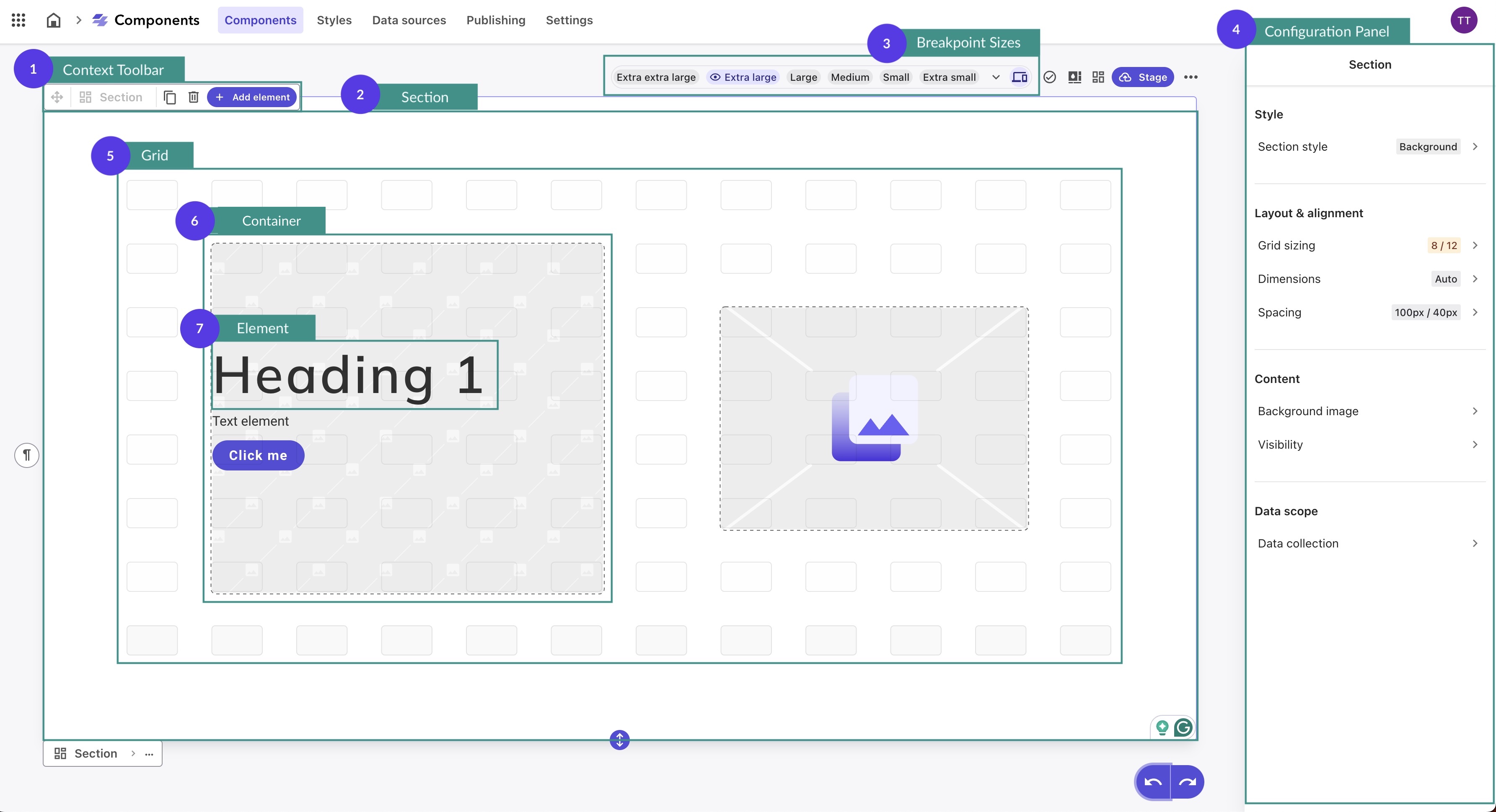
Here’s a detailed diagram of the anatomy of the Sitecore Components builder and the hierarchy of elements within a component.
| Term |
Description |
| 1. Context Toolbar |
A toolbar that appears when you click a container or element on the canvas, allowing you to:
- Define the nature of the selected container or element
- Duplicate or delete the container or element
- Add an element to a container
- Select children or parent elements within a nested structure
- Move elements within a container
- Adjust the foreground or background positioning of elements
|
| 2. Section |
The foundational element of a component. Each section features a grid system where containers are created and can also be styled. By default, each component starts with a single section, but you can add additional sections to accommodate different grid configurations within the same component. |
| 3. Breakpoint Sizes |
Viewport widths in pixels that correspond to specific device types. The XM Cloud Components Styles library includes common breakpoints, such as those for large tablets and desktop screens. You can also add custom breakpoints as needed. |
| 4. Configuration Panel |
The interface where you can adjust settings and properties for selected elements or components, such as layout, styles, and dynamic data mappings. |
| 5. Grid |
A grid system of rectangular shapes allows you to quickly and accurately organize the layout of your component. You can click and drag to create containers of various sizes and move them to the desired location within the component section. By default, grids are organized into 12 columns and 5 rows, but they can be configured differently for each section. |
| 6. Container |
A placeholder within a component that holds elements. Containers can overlap, be resized, and be repositioned to define the layout of the component. They serve as the structural framework for organizing and arranging content within the component. |
| 7. Element |
The building blocks of web design within XM Cloud Components. Elements can be added to containers and include:
Text Elements: Such as headings, paragraphs, and list items
Block Elements: Containers for content like images and cards
Inline Elements: Elements that can be placed inside text and block elements, such as buttons, badges, and links
External Elements: This allows you to nest web, react, and FEAAS components or forms built in Sitecore forms
|
Element Definitions in Sitecore Components
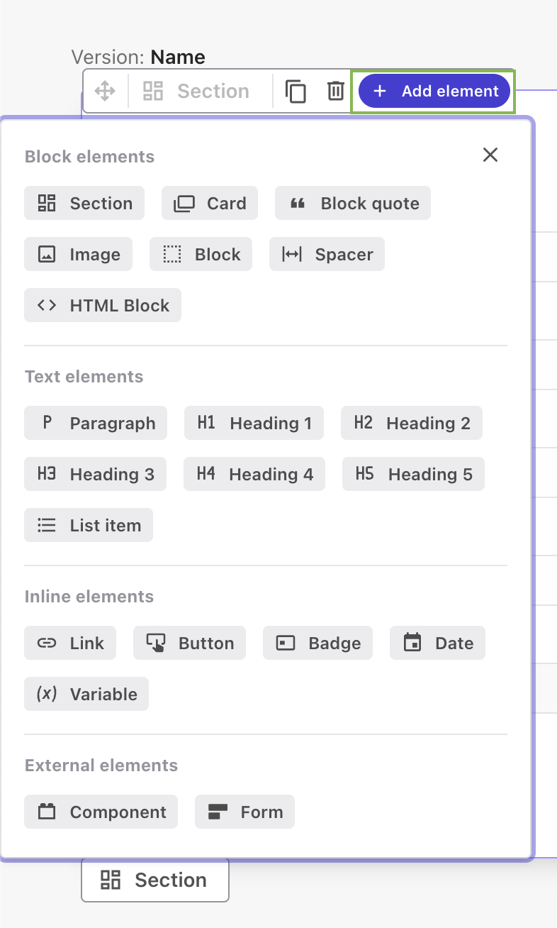
We can easily enhance the components we are building by clicking Add element in the context toolbar. You can seamlessly integrate block, text, inline, and external elements to create rich, dynamic, and engaging webpages.
| Name |
Description |
| Block Elements |
|
| Section |
Theme-able essential boxes representing top-level chunks of a component. Sections cannot be added to containers but appear under or above other sections. Use sections to add configurable grids to your component. |
| Card |
Theme-able visual boxes that provide visual framing for content. Elements that you can apply themes to and nest within other blocks. |
| Block Quote |
Quotes, tweets, and rich-styled text references. Add this element in another block element to display quotes, tweets, and rich-styled text references. |
| Image |
Image with optional accompanying text content. |
| Block |
Unstyled container for layout purposes. A basic box, not included in the Styles library. A container drawn on the grid is automatically assigned the type block, but it can be later changed to any other block element. |
| Spacer |
Flexible spacer that expands to take all available space. Use this element to create a vertical expandable gap between individual elements within a block or card. |
| HTML Block |
Raw HTML content embedded into the component. Use this element to add HTML to your component. |
| Text Elements |
|
| Paragraph |
Regular text element used for all text and copy that isn’t a heading. |
| Heading 1 |
Main heading of the document, used for the largest headings. |
| Heading 2 |
Second level of headings. |
| Heading 3 |
Third level of headings often used for taglines. |
| Heading 4 |
Further level of headings for complex documents. |
| Heading 5 |
The deepest level of heading available. |
| List Item |
Used for bulleted lists. |
| Inline Elements |
|
| Link |
Links inside text elements. Use this element to add links inside text elements and specify a relationship between the component and a web link. |
| Button |
Clickable elements used for user interactions. |
| Badge |
Element representing status and other meta information. Non-interactive element for representing status and other miscellaneous information, such as tags and labels, for example. |
| Date |
Present mapped date in human-readable format. Use to enter a date. This element reuses the styles created for badges. |
| Variable |
Inline placement to be substituted with mapped text. Unstyled inline elements that display dynamic data through data mapping. The content is text. Each variable has its own fallback. Variable elements let you mix static text and variable text. |
| External Elements |
|
| Component |
Nested web, React, or FEAAS component. Use this element to nest a component in your component. The embedded component can be another Sitecore component, or an external component, such as a React or a web component. |
| Form |
Form created in Sitecore Forms. |
Other Sitecore Component Key Terms
Understanding the remaining foundational terms in Sitecore XM Cloud Components is a necessary step for effective component creation and management. The following table highlights the last few terms that define the structure and behaviour of Sitecore Components, providing a quick reference to enhance your workflow.
| Term |
Definition |
| Canvas |
The area where all containers and elements of a component are located. By default, the canvas consists of a single section, but more sections can be added as needed. |
| Version |
An alternative rendering of a component, used to create responsive components that adapt to different screen sizes. |
| Breakpoints |
Viewport widths in pixels that correspond to certain device types. The Styles library includes common breakpoints, such as those for large tablets and desktop screens. Custom breakpoints can also be added. |
| Attribute |
The defining characteristics of an element. For example, an Image element has attributes like image source, caption, and alt text. |
| Property |
When using dynamic data, an attribute can be mapped to a property from the data tree. Properties can be content items from external sources or XM templates from an XM data source. |
| Object |
When setting up a repeater for dynamic data, an object is the parent folder containing the properties you want to repeat. |
| Repeater |
A feature that maps data containing an array of multiple objects to an element. For instance, a repeater can display various items for sale, each with a list of reviews from different users. |
Creating Components in Sitecore XM Cloud Components
Understanding the key concepts and terms in Sitecore XM Cloud Components is essential for leveraging its full potential in building dynamic, responsive, and visually consistent web pages. Whether you are dealing with static components for uniform elements, dynamic components for real-time content updates, or responsive components for multi-device adaptability, Sitecore Components offers a flexible and powerful framework to enhance your digital experiences.
Now that you have a solid understanding of the basics and fundamental concepts of Sitecore XM Cloud Components, you're ready to take the next step. Head over to Part 2, "Getting Started in Sitecore XM Cloud Components”. Here we'll get a first hand look at the Components builder in XM Cloud and how to access it.
Stay tuned for more content on how to fully leverage Sitecore XM Cloud's powerful features to create dynamic, engaging, and fully customized components.
Until next time, happy authoring!