Reading time: 5 min read
Implementing Theming in Sitecore Headless XM Cloud With Tailwind CSS
Streamlining Dynamic Theming with Sitecore and Tailwind CSS
Start typing to search...
When building modern web applications, theming is an essential feature that enhances user experience by allowing dynamic changes in the appearance of the application. In this blog, we'll explore how to implement theming in Sitecore Headless XM Cloud using Tailwind CSS for each component, ensuring a flexible and scalable approach to styling.
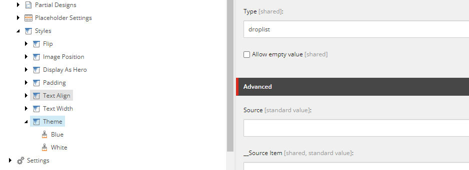
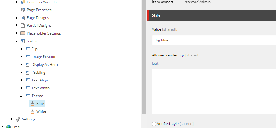
First, you need to create a theme configuration under Presentation/Style in your Sitecore Headless XM Cloud setup. Name this configuration Theme and define variables such as blue and white. Assign values to these variables like bg:white and bg:blue. These themes should then be assigned to all components across your application.
Within your component's code, the theme can be accessed from the params.style object, which you define in Sitecore. For example, in your React component, you can access this style via props.params?.Styles.
Create a utility function to parse these styles effectively. This function will be placed in a file named rendering-props.ts under the util folder. Here’s how you define it:
import { mapping } from './rendering-props-mapping';

export type RenderingPropsMapping = {
  [key: string]: { [subKey: string]: string };
};

type RenderingProps = {
  bg: string;

};

const parseRenderingProps = (input: string | undefined): RenderingProps => {
  const result: RenderingProps = {
    bg: mapping.bg.default,

  };

  if (!input) {
    return result;
  }

  const properties = input.split(' ');

  properties.forEach((prop) => {
    const [propertyKey, value] = prop.split(':');

    if (!propertyKey || !value) {
      return;
    }

    switch (propertyKey) {
      case 'bg':
        result.bg = mapping.bg[value] ?? mapping.bg.default;
        break;

      default:
        console.warn(`Invalid rendering property key: ${propertyKey}`);
        break;
    }
  });

  return result;
};

export { parseRenderingProps };
export type { RenderingProps };
This function takes a string input, splits it into properties, and assigns values based on the predefined mapping. It helps dynamically assign classes based on the component’s theme configuration.
Create a mapping file (rendering-props-mapping.ts) to map the styling values to the appropriate CSS classes:
import { RenderingPropsMapping } from './rendering-props';

// Your mapping object
export const mapping: RenderingPropsMapping = {
  bg: {
    blue: 'theme-blue',
    black: 'theme-black',
    green: 'theme-green',
    white: 'theme-white',
    grey: 'theme-grey',
    default: 'theme-white',
  },

};
Define your themes in the global.css file and use Tailwind plugins to create utility classes that apply these theme styles:
.theme-white {
  --bg: var(--next-white);
  --accent: var(--next-white);
  --accent-2: var(--next-blue);
  --text: var(--next-black);
}
Tailwind CSS offers extensive customization capabilities, allowing you to define your themes based on the unique requirements of your project. In your Tailwind configuration, the plugins section is particularly useful for adding custom properties and utilities that match your theming system. This allows you to create a more dynamic and adaptable styling environment.
Here's how you can define customizable properties in the plugins section of your Tailwind configuration:
plugins: [
   // Custom plugin for adding theme-specific utilities
  plugin(({ addUtilities }) => {
    addUtilities(themeClasses({ name: 'background', colorVariable: 'bg' }));
    addUtilities(themeClasses({ name: 'copy', colorVariable: 'text' }));
    addUtilities(themeClasses({ name: 'accent', colorVariable: 'accent' }));
    addUtilities(themeClasses({ name: 'accent-2', colorVariable: 'accent-2' }));
  }),
];
Once you have set up your theming structure and parsing functions, the next crucial step is to integrate these into your components. This involves initializing and applying the parsed rendering properties to manage your component's styling dynamically based on the theme.
First, initialize the rendering properties using the parseRenderingProps function within your component's state:
const [renderingProps, setRenderingProps] = useState<RenderingProps>(() => {
  return parseRenderingProps(props.params?.Styles);
});
This step extracts the theme-related styles from props.params?.Styles and stores them in your component’s state. This state will automatically update your component's classes whenever the theme changes.
Next, apply these styles directly within your component's structure to ensure that the theme is applied dynamically:
<div className={`${renderingProps.bg} mx-auto max-w-7xl background-bg copy-text xl:pl-2`} data-component="text-banner">
  {/* Component content here */}
</div>
Here, you are using the className attribute to apply the background and text styles dynamically. The class names background-bg and copy-text are examples of utilities that you might define in your Tailwind configuration, allowing for seamless theme changes.
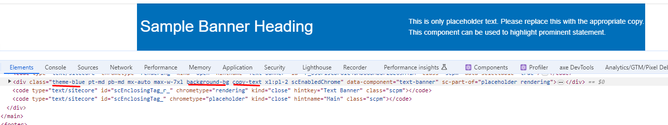
Blue Theme Example:
White Theme Example:
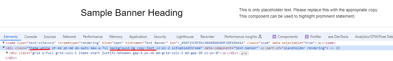
These examples serve as a practical demonstration of how themes can dramatically alter the look and feel of your components with minimal changes in the backend code.
We've detailed how to implement dynamic theming in Sitecore Headless XM Cloud using Tailwind CSS, enhancing both aesthetics and consistency across components. By following the outlined steps and leveraging Tailwind's customization, you can significantly improve your application's user experience. Our examples, including the blue and white themes, illustrate the practical impact of these theming techniques.
Effective theming involves thoughtful integration of CSS variables and utility classes, combining Sitecore's capabilities with Tailwind's styling tools. With this approach, you can create a responsive, visually appealing interface that adapts to various design needs.