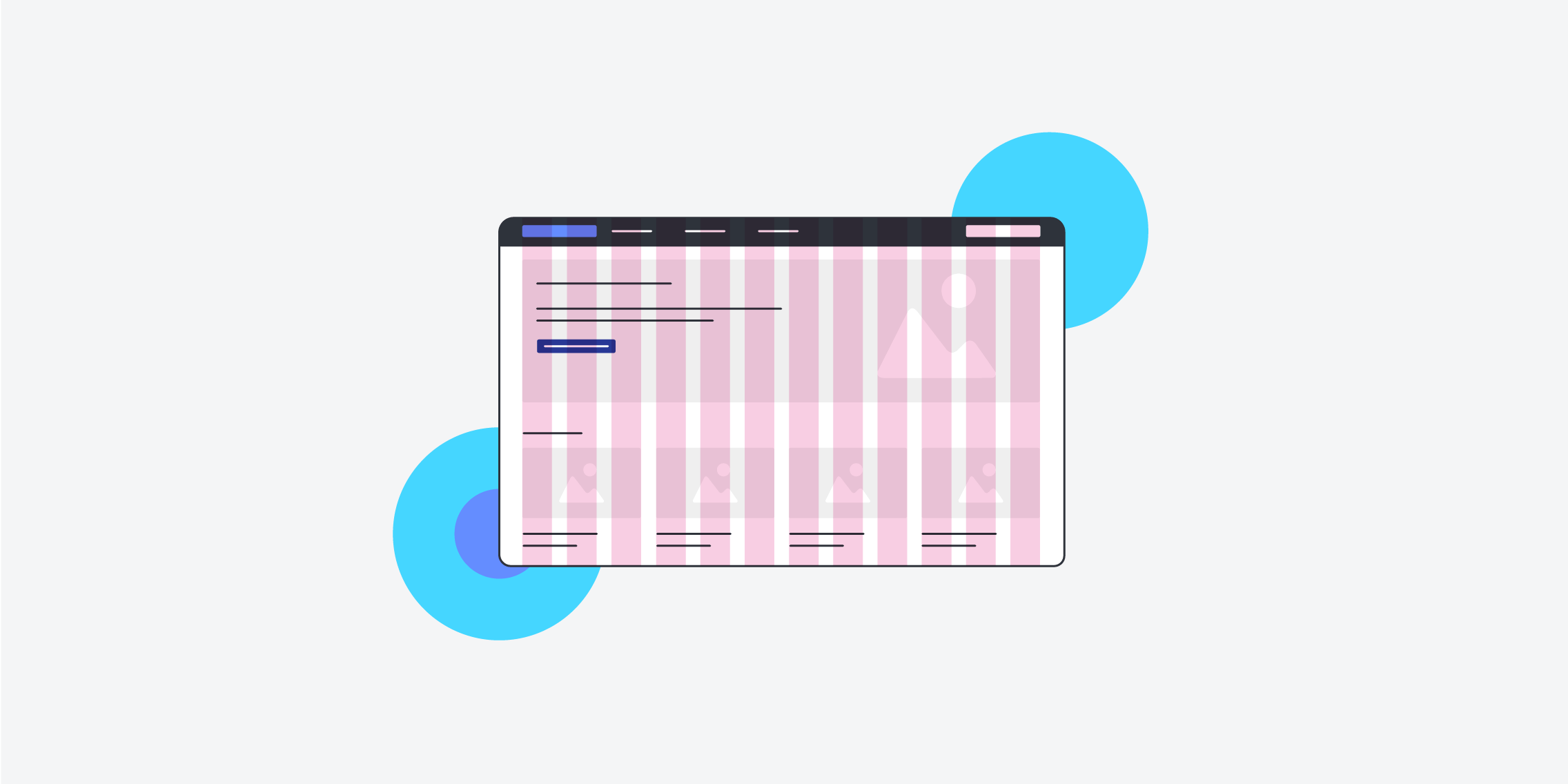
Grid Systems for User-friendly Websites
A well-organized layout is critical in web design for developing visually beautiful and user-friendly websites. Designers use grid systems to do this, which is a structured framework that divides the homepage into a series of columns and rows. The grid system serves as a solid foundation for organizing content, assuring consistency, and supporting responsive design across multiple devices. In this article, we'll look at the various types of grids used in web design, emphasizing their advantages and applications.

Different Type of Grids in UI-Design
1. Fixed Grid
The fixed grid is one of the simplest and oldest grid systems used in web design. In this layout, the width of the columns and gutters (spaces between columns) remains fixed, regardless of the device or screen size. While it offers a predictable layout, it can be less adaptable for responsive design. Fixed grids are suitable for projects where precise control over the design is required, or when a designer wants to maintain a consistent aesthetic on all devices.
2. Fluid Grid
Unlike fixed grids, fluid grids are more flexible as they adjust their column widths and gutters proportionally with the screen size. The elements within a fluid grid expand or shrink according to the user's viewport, ensuring a more seamless viewing experience on various devices. Fluid grids are excellent for maintaining a consistent design across devices and are especially useful in today's multi-device world.
3. Responsive Grid
With the rise of mobile devices, responsive design has become a crucial aspect of web development. A responsive grid system incorporates media queries and breakpoints to adapt the layout to different screen sizes dynamically. It allows designers to craft unique designs for specific devices, ensuring optimal user experience on desktops, tablets, and smartphones.
4. Bootstrap Grid
Bootstrap, a popular front-end framework, introduced its own grid system that has become widely adopted in web development. The Bootstrap grid is based on a 12-column layout and offers a responsive design out of the box. Designers can easily create complex layouts by combining and nesting these columns, along with predefined utility classes. Bootstrap's grid system significantly speeds up the development process and promotes consistency throughout the project.
5. Masonry Grid
Masonry grids break away from the traditional column-based layouts. Instead, they arrange elements vertically, fitting them into the available horizontal space without adhering to strict row structures. This type of grid system is particularly useful when dealing with dynamic content of varying heights, such as image galleries or Pinterest-style layouts. Masonry grids provide a visually interesting and flexible approach to web design.
6. CSS Grid Layout
CSS Grid Layout is a powerful native layout system in CSS that allows designers to create complex, two-dimensional grid structures. It provides complete control over both rows and columns and enables the placement of elements in specific grid areas. The CSS Grid Layout is highly versatile and works exceptionally well for designing both simple and intricate page layouts.
In Closing
Grids are an essential component of web design, as they help create well-organized, visually appealing, and user-friendly websites. The choice of grid system heavily depends on the project's specific requirements and the desired level of responsiveness. Designers can choose from fixed and fluid grids for predictable layouts, responsive grids for adjusting to different devices, and new techniques like Masonry grids and CSS Grid Layout, each with its own set of advantages to explore.
Whether you're a seasoned designer or just starting out, understanding and utilizing the right grid system can greatly enhance your web design capabilities, leading to a more successful and engaging online presence. Experiment with different grid types, embrace responsive design, and empower yourself to create websites that leave a lasting impression on users across all devices.
Happy designing!


