A Comprehensive Guide to Mastering Placeholder Functionality in Sitecore XM Cloud
Tired of placeholder issues in Sitecore XM Cloud? Discover how to fix them with Nextjs workarounds.
Tired of placeholder issues in Sitecore XM Cloud? Discover how to fix them with Nextjs workarounds.
Start typing to search...
When working with Placeholders on a Nextjs project with Sitecore XM Cloud, issues may come up. Sitecore has deployed updates on a package [templates/nextjs-sxa] used for Headless projects; recent updates on JSS, specifically 21.0.5, have updated some functionality on Placeholders for XMCloud and Nextjs.
Some of the issues are the following when incorrectly setting up the placeholder.
The initial solution for components having only one placeholder setup is pretty straightforward.
Format your placeholder key having a single string with no dashes followed by {*}. It should look like this placeholdertext-{*} . Don’t forget to add your placeholder inside your rendering.
Add your placeholder in the Placeholder Settings in your Content with the format placeholdertext*

In your Nextjs component, set up the component similar to the example below.

Sitecore Documentation: Walkthrough: Configure your renderings to use dynamic placeholders
When we format our placeholders as placeholdertext-{*} it works fine with Allowed Controls and setting up a page in Experience Editor, but it currently has limitations. When a component requires two placeholders and applies the format, the component breaks in Experience Editor.
Looking into the warnings, the placeholders returned aren’t quite correct. Sitecore has set up two components which handle multiple placeholders Row Splitter and Column Splitter which are working properly.
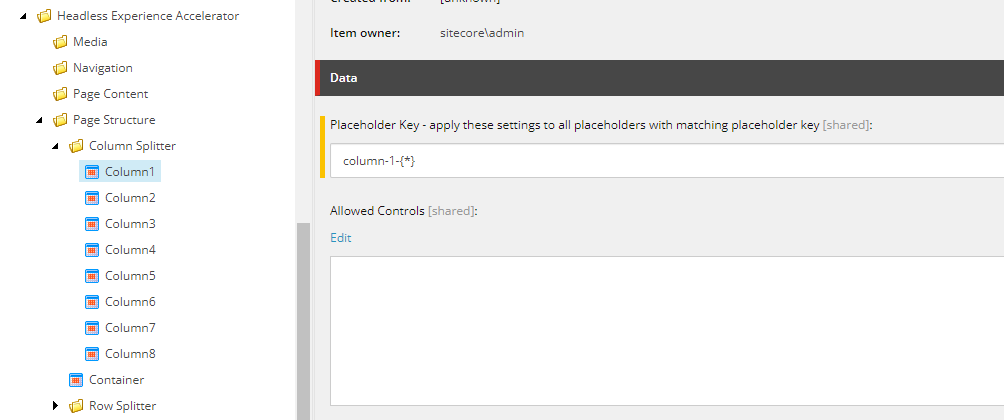
Before introducing the workaround, I’ll provide how we were able to come up with this solution and how were able to investigate and discover it. Looking at how the Column Splitter placeholder and rendering are set up.

Column Splitter Placeholder and Placeholder Key


Column Splitter Nextjs Component
We can see that by assigning your keys as placeholder-${number}-{*} , everything should be working properly. But after applying it, it seems to give us an error and tells us that the placeholders aren’t set up.

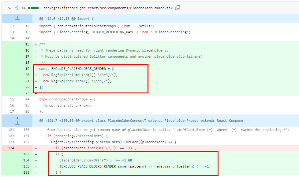
Looking deeper into how things work by checking out the files handling our Placeholders.

I tried testing the regular expression to see if it could be reused.

We can see that the certain fix can only be applied to the column and row splitters, but with how the regex is setup we can do some tweaking and apply our own Allowed Controls on our own components by simply setting up our placeholder keys as
[placeholder_string]column-{digit}-{*}
With what we found out, we can now start creating our own component, which has multiple placeholders set. Let’s start off with a component called TwoColumn which has two placeholders.
twocolumn-1-{*} and twocolumn-2-{*} will be our placeholders. Let’s set it up in Sitecore


We then apply the right Allowed Controls on the Placeholder Settings on the Content details.

Apply the same Placeholder names on our Nextjs component.

After setting up the component in Experience Editor, the placeholders should be working now.

This is just a workaround and still has its own limitations. With how the logic works, we can only set up a single Allowed Control that will be used for our multiple Placeholders. We cannot have different Allowed Control for each of them.