Understanding Rendering Parameters in Sitecore XM Cloud Page Builder
Sitecore XM Cloud Page Builder changes the way users interact with Rendering Parameters from components by making it easily available and always visible.
When creating components, it is not clear for developers what is driving all the fields and sections available. Sitecore SXA’s Headless out of the box components are a good start, but they make the “Layout” section available to all components, and most of the custom components may not support authors changing the grid.
This post explores all base templates and their function in Page Builder, and in the end, it offers a simpler solution on which to base your rendering parameters. You can skip to the end in the TL;DR section if not interested in the details.
Sitecore SXA Out of the Box Rendering Parameters
The components offered by Sitecore have all their rendering parameters based on the following templates, with their respective base templates nested:
- Base Rendering Parameters
- IStyling
- IComponentVariant
- Grid Parameter
- Standard Rendering Parameters
- IDynamicPlaceholder
- _PerSiteStandardValues
- IRenderingId
See that the most basic required base template is nested under Grid Parameter. This setup causes most developers to end up adding Grid Parameters to their rendering parameters template inadvertently.
Understanding All Base Templates
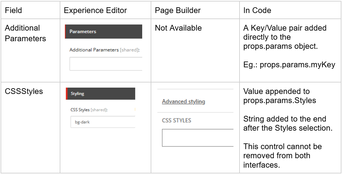
Standard Rendering Parameters
ID: {8CA06D6A-B353-44E8-BC31-B528C7306971}
Fields: Placeholder, Data Source, Additional Parameters, and CSSStyles
IStyling
ID: {D959F476-2A2C-40C6-81F5-FB75342BBFB9}
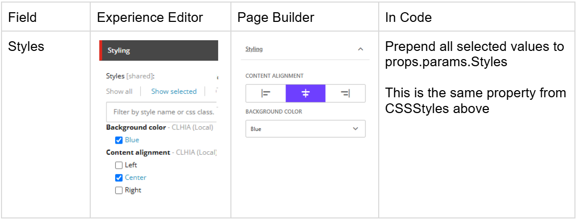
The style list is configured in your tenant under /Presentation/Styles
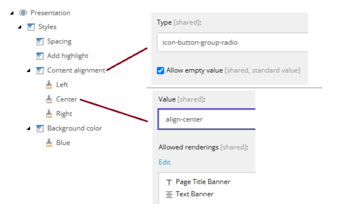
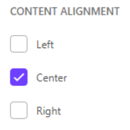
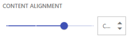
In the Style item, you can configure how it is presented in Page Builder. In Experience Editor, it is always a list of checkboxes.
checkbox-folder (multi-selection)
droplist (single-selection)
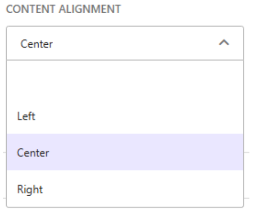
icon-button-group-check (multi-selection)
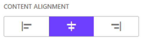
icon-button-group-radio (single-selection)
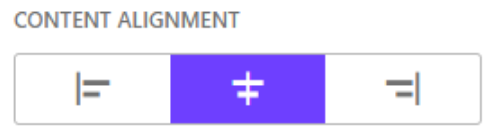
slider (single-selection)
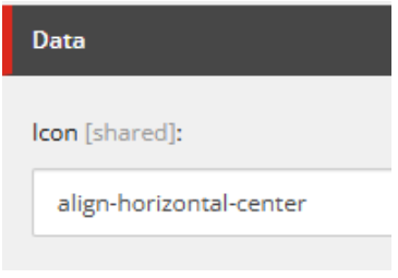
Defining the icon for each button
IComponentVariant
ID: {A9F8A74E-5F7D-4506-8661-B08E7B9A7B91}
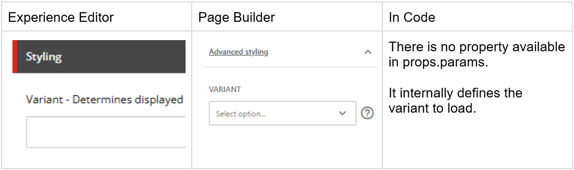
By having IComponentVariant as a base template, Sitecore will always show the dropdown even when there are no variants available. I recommend adding this base template only for components that have multiple variants.
*Note: Variant details are out of scope for this post.*
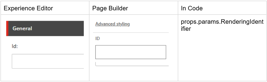
IRenderingId
ID: {3DB3EB10-F8D0-4CC9-BE26-18CE7B139EC8}
IDynamicPlaceholder
ID: {5C74E985-E055-43FF-B28C-DB6C6A6450A2}
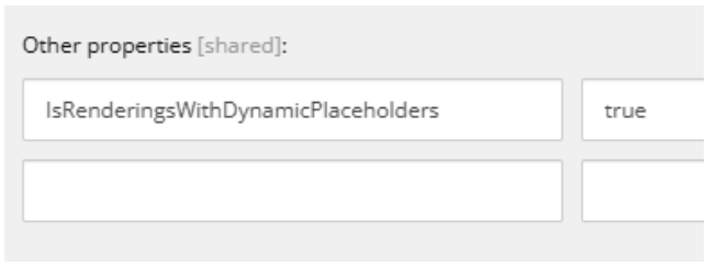
This field is not available for editing in Page Builder and there is a message in Experience Editor for authors not to change it.
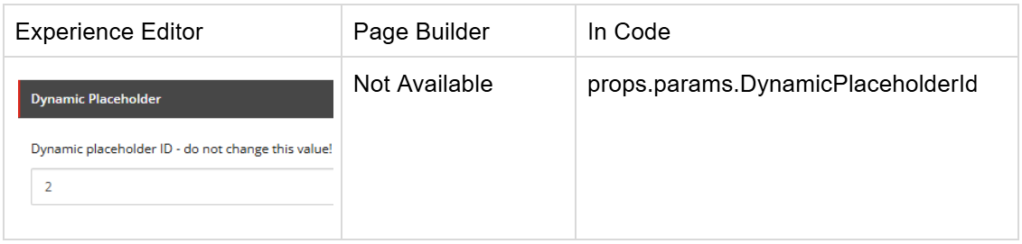
In the Rendering Item, not the rendering parameters template, you need to set this value to true so Sitecore will auto-fill it with a unique value.
Base Rendering Parameters
ID: {4247AAD4-EBDE-4994-998F-E067A51B1FE4}
This base template is just an aggregator of IStyling, IComponentVariant, and Grid Parameter.
_PerSiteStandardValues
ID: {44A022DB-56D3-419A-B43B-E27E4D8E9C41}
This base template does not affect the author's experience, its functionality is out of scope for this post.
Grid Parameter
ID: {FF75632A-03ED-4D31-B42A-1EEE45E5147F}
Field: GridParameters (Type: Grid Parameters)
This base template contains the specialized field GridParameters, allowing the component to display the Grid Parameters options based on the Grid System defined for your site.
The Grid System is defined in the Settings item in your website.
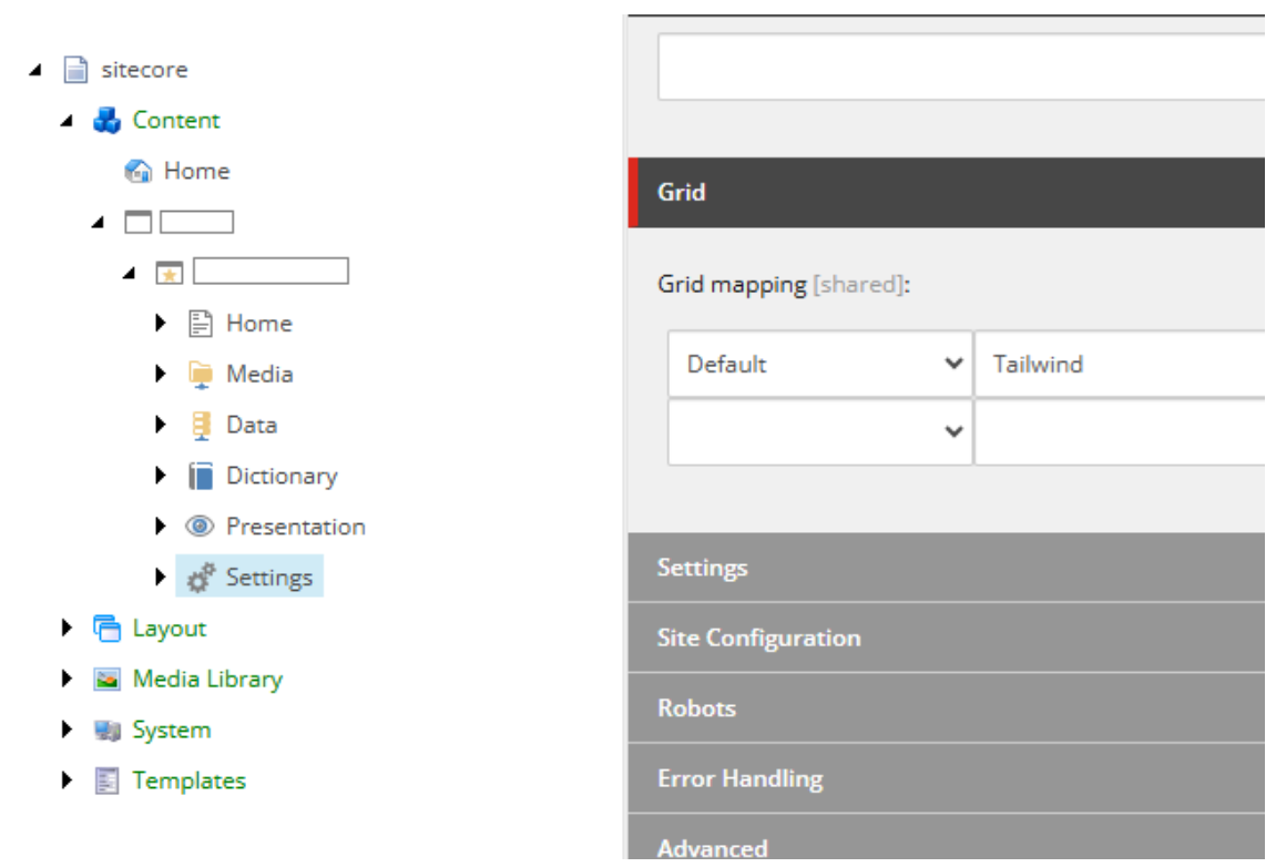
The grid systems are in: /sitecore/system/Settings/Feature/Experience Accelerator along other unrelated settings.
For out of the box Sitecore Headless Experience Accelerator components, only Bootstrap5 is supported at the time of this post. You need to build your own support for different grid systems.
I recommend setting the Grid Parameter only for structural components when you want to allow authors to configure different options from the grid system themselves.
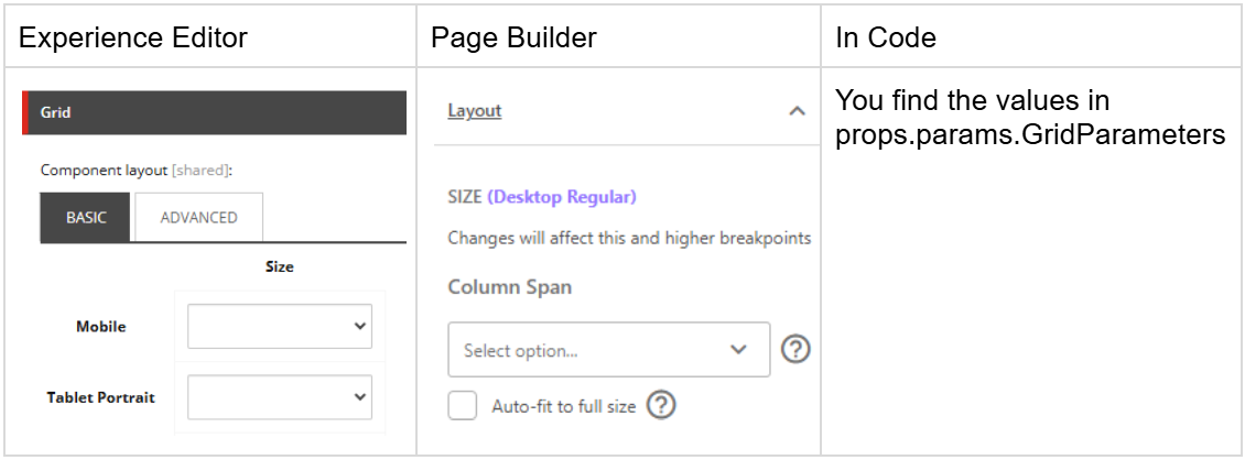
The options in “Layout” are controlled by the System Grid setup:
For Grid Systems, you can read more in the links below:
- https://doc.sitecore.com/xmc/en/developers/xm-cloud/the-grid-settings.html
- https://doc.sitecore.com/xmc/en/developers/xm-cloud/configure-headless-sites-to-use-tailwind.html
Page Builder Screen Sizes vs Grid System Devices
You may notice that the Grid System devices will not match the screen sizes available in Page Builder. In Page Builder, you get a fixed list of screen sizes which are mapped to the Grid System devices using the Min and Max fields.
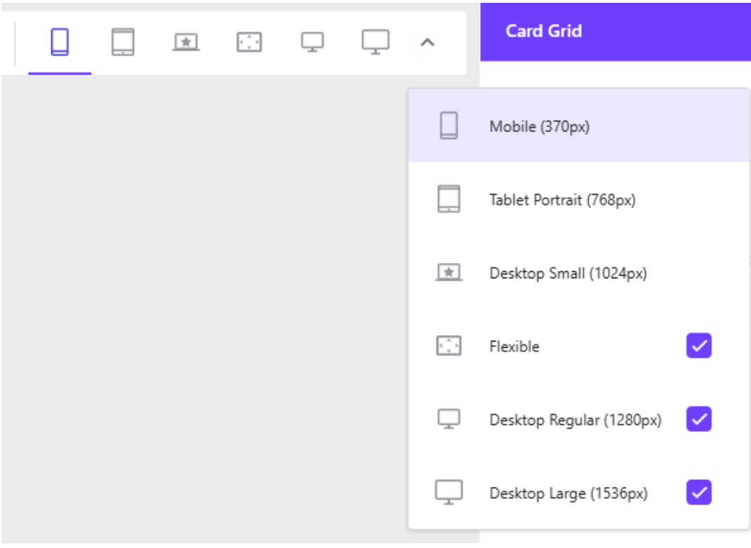
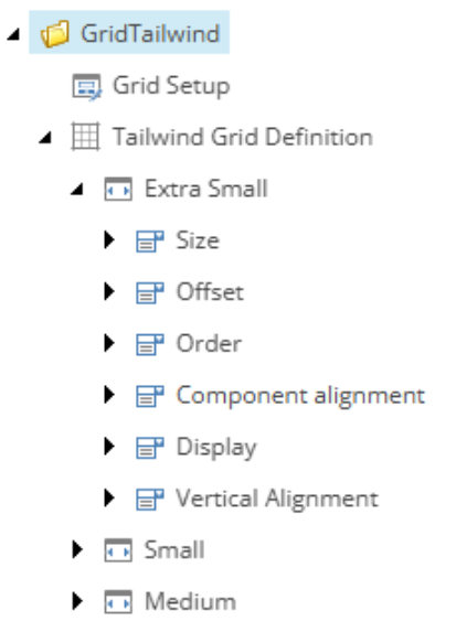
These are mapped the Devices items configured under the Grid Definition.
For Bootstrap 5 it is defined under /sitecore/system/Settings/Feature/Experience Accelerator/Bootstrap 5/Bootstrap 5
You can find the section Grid Breakpoints in the Device item, with a Min and a Max field.
Page Builder will map the screen size to the first item found with an interval containing Page Builder’s defined size.
For instance:
- Min=1 and Max=370 maps to Mobile (370px).
- Min=371 and Max=768 maps to Tablet Portrait (367px).
Flexible always uses the same definition as Desktop Small (1024px).
TL;DR
For your custom component I recommend creating your own base templates. There are two:
Base Component Rendering Parameters
Base Templates:
- Standard Rendering Parameters
- IRenderingId
- IStyling
- _PerSiteStandardValues
- IDynamicPlaceholder
Base Template (copy and paste):
{8CA06D6A-B353-44E8-BC31-B528C7306971}|{3DB3EB10-F8D0-4CC9-BE26-18CE7B139EC8}|{D959F476-2A2C-40C6-81F5-FB75342BBFB9}|{44A022DB-56D3-419A-B43B-E27E4D8E9C41}|{5C74E985-E055-43FF-B28C-DB6C6A6450A2}
Base Component Rendering Parameters with Grid
Base Templates:
- Standard Rendering Parameters
- IRenderingId
- IStyling
- _PerSiteStandardValues
- IDynamicPlaceholder
- Grid Parameter
Base Template (copy and paste):
{8CA06D6A-B353-44E8-BC31-B528C7306971}|{3DB3EB10-F8D0-4CC9-BE26-18CE7B139EC8}|{D959F476-2A2C-40C6-81F5-FB75342BBFB9}|{44A022DB-56D3-419A-B43B-E27E4D8E9C41}|{5C74E985-E055-43FF-B28C-DB6C6A6450A2}|{FF75632A-03ED-4D31-B42A-1EEE45E5147F}
IComponentVariant
Add IComponentVariant when you actually have a variant available. Optionally, and for simplicity add IComponentVariant to the two Base Components if you don't mind the empty dropdown.
{A9F8A74E-5F7D-4506-8661-B08E7B9A7B91}