Reading time: 10 min read
Keeping Your Sitecore Next.js App Fast with Lightweight and Scalable Icons
Five lightweight icon sets that balance speed and design.
Start typing to search...
Icons are essential for improving the usability and aesthetic appeal of contemporary web apps. Choosing and incorporating the appropriate icons into a Next.js application powered by Sitecore helps enhance user experience while guaranteeing content creators' flexibility. Five free icon libraries that work well with Sitecore and Next.js will be examined in this blog post. We'll go over how to make icons in Sitecore dynamically editable, installation procedures, and implementation techniques.
I think it’s important to understand the role of icons. Icons have grown up with us. They are an essential component of web design and are valuable and helpful for improving the user interface (UI) and user experience (UX). In more detail:
Icons boost the design's scalability to different screen sizes and devices and increase the flexibility of content production for a Next.js application powered by Sitecore.
Next it’s important to determine whether you are looking at static icons or animated icons, both have their own significant pros and cons.
Pros:
Cons:
Pros:
Cons:
Just like static and animated icons, each format has it’s own pros and cons and you have to pick which is the best fit for purpose in your application.
| Format | Pros | Cons | Best Use Cases |
|---|---|---|---|
| SVG | High quality at any size, easily styled with CSS, lightweight | Manual import per icon used | Buttons and navigation elements |
| Font Icons | Easy Implementation, supports CSS styling | Adds to your font library, limited customization | UI frameworks and large icon sets |
| Lottie (i.e. JSON based animation) | Ideal for animations, smaller file sizes | Requires JS to work | Animated buttons, loading spinners, interactive elements |
| PNG / JPG | Universally supported, no additional libraries required | Fixed size, cannot be styled | Legacy support |
| CSS/JS | No dependencies in addition | Need to know animation skills | Hover effects and interactive elements |
The greatest options for a Sitecore Next.js application are SVG and Lottie, especially if you’re looking for icons that must be lightweight and simple to customize are ideal for SVGs and add life without sacrificing performance.
Let’s be honest, there are dozens of options out there for icon solutions. Some are separate from larger UI frameworks, some are embedded in UI frameworks. Here we’re going to look at five of the ones we’ve either used or investigated as part of implementations.
The ones we’ll look at today are, in no particular order:
So let’s look at these more in depth shall we?
While heroicons doesn’t have a huge inventory of icons unlike the others in this list, coming in presently at 316 icons, their simplistic, minimal, clean-cut presentation, along with an MIT license, and support for React makes them an easy choice for adding just that bit extra to buttons, tabs, navigation, etc. And, at the time of this writing, they are free for commercial use. They support both SVG and JSX components and thus modifying them to suit your color scheme, again, super easy to do.
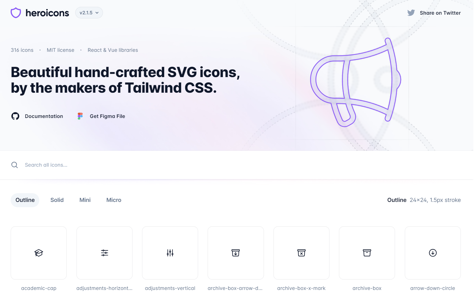
To use them simply run the following npm command:
npm install @heroicons/react
Using them in a component is also very easy to do, simply import the icon you are after and use them along with any styling like you would any other component.
import { HomeIcon } from '@heroicons/react/24/solid';

export default function IconComponent() {
  return <HomeIcon className="w-6 h-6 text-blue-500" />;
}
If you wanted to, say, control what icon people use within Sitecore via a droptext field perhaps, you can do that and create a custom HeroIconComponent like so.
import * as HeroIcons from "@heroicons/react/24/solid";

type HeroIconComponentProps = {
  iconName: string;
  className: string;
};

export default function HeroIconComponent({
  iconName,
  className,
}: HeroIconComponentProps) {
  const IconComponent = HeroIcons[iconName as keyof typeof HeroIcons];
  return IconComponent ? <IconComponent className={className} /> : null;
}
You can now reference that component like so:
import HeroIconComponent from "./components/Icons/HeroIconComponent";

<HeroIconComponent iconName="HomeIcon" className="w-6 h-6 text-blue-500" />
You can adjust this so that your field value is what’s sent in removing the need to maintain the component architecture in code and moving it to an authoring task.
Perhaps the most well known icon set in this list, and probably longest running, Font Awesome has both a paid and free offering. They offer both SVG, Web Font and React components as of recently.
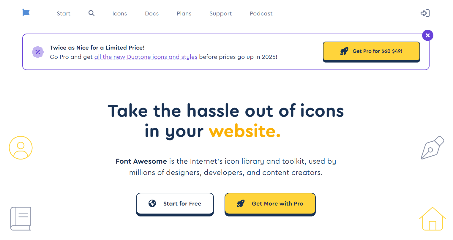
You can install the fonts in your Next.js similarly as to other, with a few more steps.
npm i --save @fortawesome/fontawesome-svg-core
npm install --save @fortawesome/free-solid-svg-icons
npm install --save @fortawesome/react-fontawesome
Then add them into your component. Again, requiring a bit more steps.
import { FontAwesomeIcon } from '@fortawesome/react-fontawesome'
import { faCoffee } from '@fortawesome/free-solid-svg-icons'
...
<FontAwesomeIcon icon={faCoffee} />
You could theoretically do something similar to what we did with heroicons, however it’d be a bit more complex given the structure.
Feather is another icon set, with an MIT license and supports both SVG and JSX components. It’s been around a long time and has a fair bit of consistency, but updates to it are far and few between.
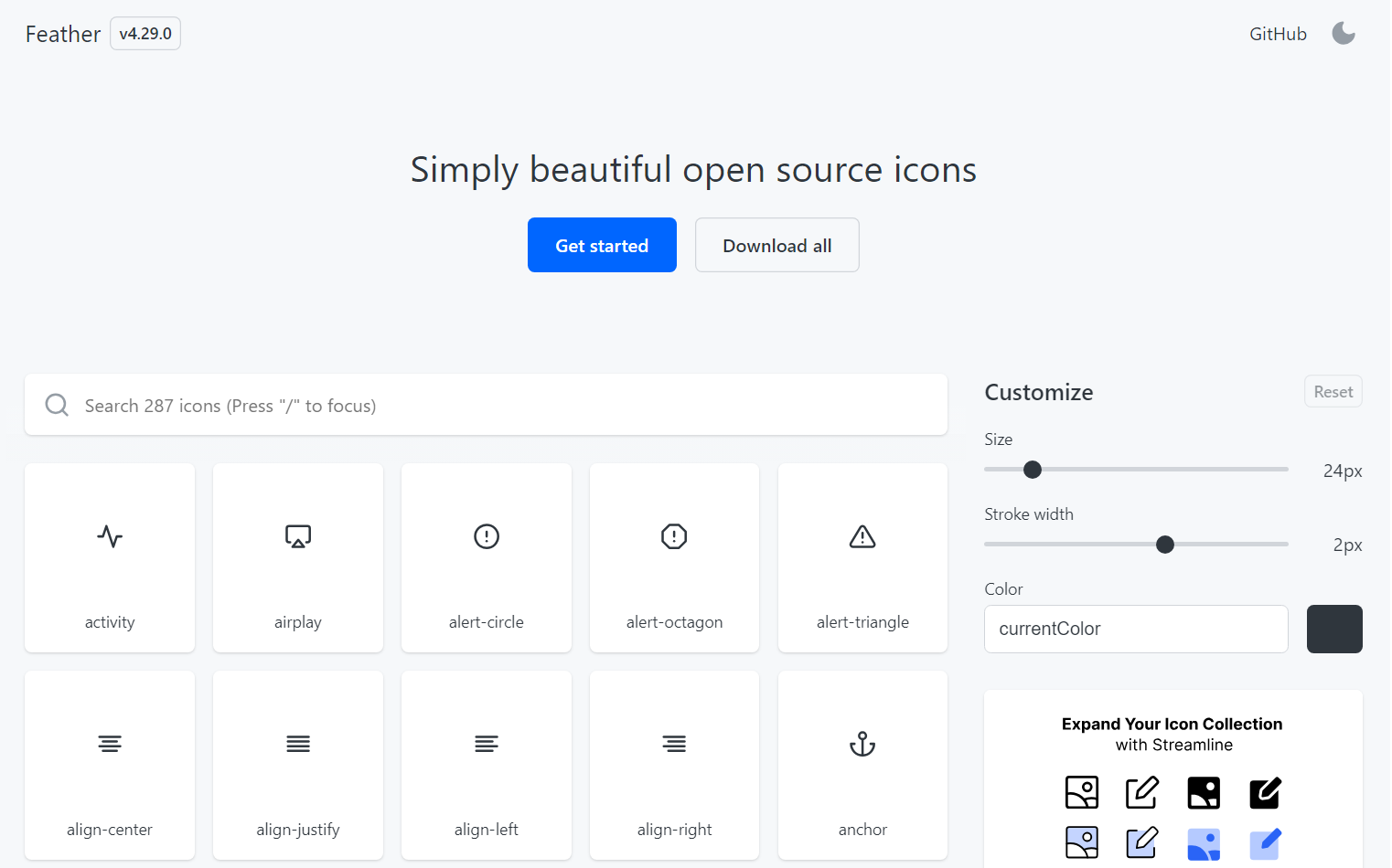
Just like heroicons, it’s extremely easy to use and customize.
npm install react-feather
Using it, within a component is also straight forward. You can import a single icon and then use it as part of the design.
import { Home } from 'react-feather';

<Home size={24} color="black" />;
And just like heroicons, we can create a custom FeatherIconComponent, that be used via Sitecore. There are more options other than size and color. You can also change strokeWidth, className and style.
import * as FeatherIcons from 'react-feather';

type FeatherIconComponentProps = {
  iconName: string;
  className: string;
};

export default function FeatherIconComponent({ iconName, color}: FeatherIconComponentProps) {
  const IconComponent = FeatherIcons[iconName as keyof typeof FeatherIcons];
  return IconComponent ? <IconComponent className={className} /> : null;
}
Unlike the others, Tabler boasts an massive number of icons. As of this writing, 5862 to be exact. Now that might seem like a lot but as you’ll see some are only slight variations of others. And like others they also have an assortments of libraries that allow you to integrate your application with.
Let’s have a look at what that looks like.
npm install @tabler/icons-react
And then within your component it doesn’t take much to use. However, unlike Feather, you can only pass in size, color, stroke.
import { IconArrowLeft } from '@tabler/icons-react';

<IconArrowLeft />
Given the limitation of what you can customize, while you can make these available like we did others via a droptext and make it infinitely customizable, you might not choose this package for that purpose. These icons might be more suited to finding the ones you like, download, and use within your project directly.
Finally we come to Lordicon, which has far and above perhaps the most icons. However, like Font Awesome, many of those icons are hidden behind a pro tier. Now, you still have access to some 7k+ icons in the free tier, and it does have the same personal & commercial license as the pro tier.
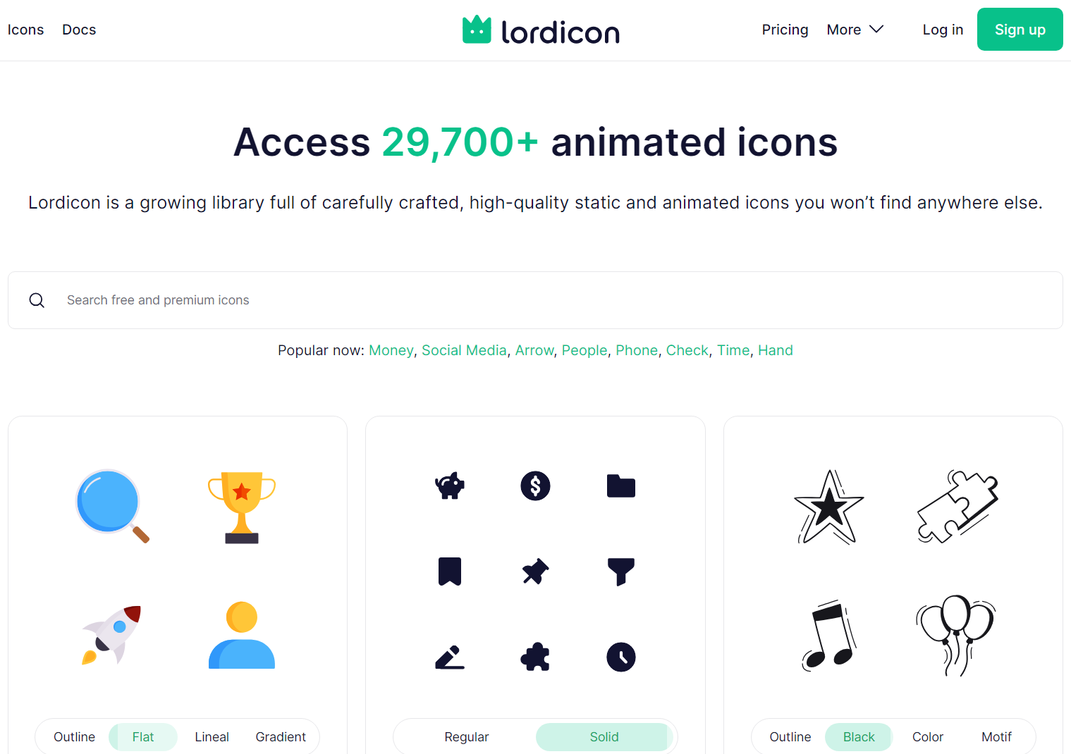
Like the rest, let’s get this installed into our project.
npm install @lordicon/react
While installing it was just like the others, because these are, by default, Lottie JSON type, though you can get an SVG type, there is a bit more work to get the icons to function.
You can see a wealth of examples on how to use them here. The beauty behind Lottie JSON animations is you can determine when to trigger or end an animation. Even pausing and continuing an animation, which would be great for something like a loading animation. There really are a lot of pros:
It does however, come with downsides, besides what we mentioned earlier. Notably:
Like everything, right out of the box, it’s not perfect. You have to mold it to fit your needs. And like everything, there’s ways to improve things like performance.
Regardless of which you go with you need to ensure you’re using them properly. For libraries like Tabler and Heroicons, use named imports instead of full-library imports.
We did this earlier, and while it does work, it’s expensive on performance.
import * as HeroIcons from "@heroicons/react/24/solid";
If you have a limited set of icons for a user to pick them, then name rather than including all.
Font Awesome can load unnecessary characters and styles, making it heavier than inline SVGs. It’s easy enough to create shared components like this one.
export default function InlineSVGIcon() {
  return (
    <svg width="24" height="24" viewBox="0 0 24 24" fill="none" stroke="currentColor" strokeWidth="2">
      <path d="M10 20v-6h4v6m-7 0h10M5 12l7-7 7 7" />
    </svg>
  );
}
Next Image is a powerful tool that not many take advantage of. It’s certainly worth migrating to if you have the patience.
import Image from 'next/image';

export default function CachedIcon() {
  return <Image src="/icons/home.svg" width={24} height={24} alt="Home Icon" priority />;
}