Intro to the Styles Library in Sitecore XM Cloud Components
Welcome to my newest blog series, tackling the topic of the style library in Sitecore XM Cloud Components. The first part of our three-part series will begin with understanding what the Sitecore XM Cloud Components style library is, and why you need it.
There is a lot of information to cover, so we split the blogs to make it easier to navigate. If you want to skip the introduction, head over to Part 2 — Defining Your Styles Library in Sitecore XM Cloud Components to get started.
The Sitecore Components Style Library
Sitecore XM Cloud Components enables marketers to design and customize web pages by easily adding and configuring various elements within a component. This low-code/no-code process involves adjusting the layout, alignment, sizing, and placement of these elements, all through the Sitecore Components builder.
| Style Library Category | Element | Description |
|---|---|---|
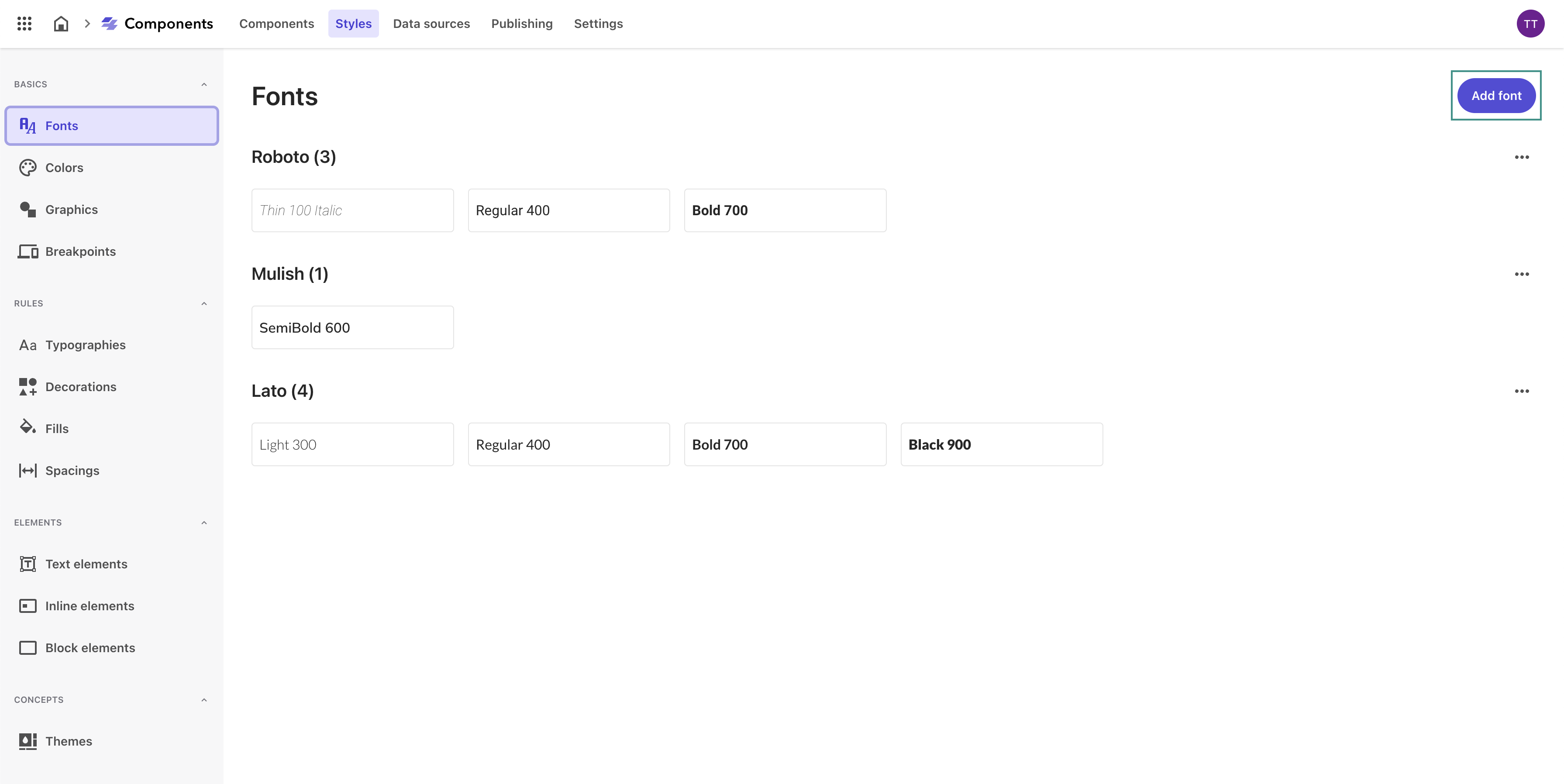
| Basics | Font | Select and define the fonts to be used throughout your digital properties for consistency and readability. |
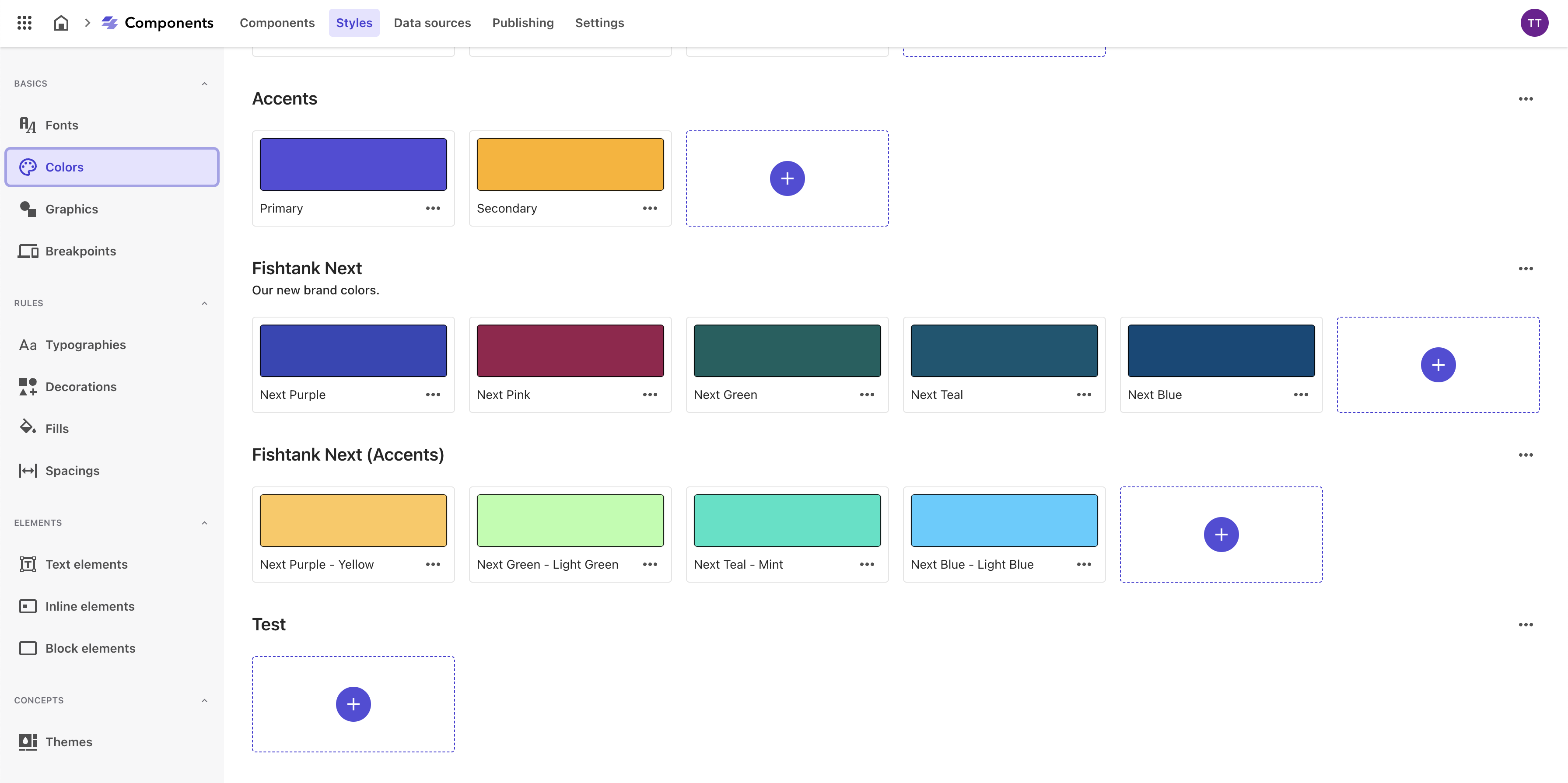
| Colors | Establish a color palette that aligns with your brand’s visual identity, including primary, secondary, and tertiary colors. | |
| Graphics | Upload and manage graphical assets like logos, icons, and background images, ensuring they are optimized for web use. | |
| Breakpoints | Define custom breakpoints to create responsive designs that adapt seamlessly to different screen sizes. | |
| Rules | Typographies | Set detailed text styles, including font size, weight, line height, and letter spacing for consistent and legible text elements. |
| Decorations | Define borders, shadows, and other decorative elements to add depth and visual interest to components. | |
| Fills | Establish background colors, gradients, and patterns to create visually distinct sections and components. | |
| Spacings | Specify padding and margin values to ensure well-spaced elements and a balanced layout, enhancing readability and visual harmony. | |
| Elements | Text Elements | Define styles for headings, paragraphs, and lists, specifying typography and color settings to maintain consistency. |
| Inline Elements | Style interactive components like buttons, badges, and links with clear and consistent settings. | |
| Block Elements | Style structural components like sections, cards, and containers to ensure coherence across the layout. | |
| Concepts | Themes | Combine predefined elements and style rules into cohesive themes that can be applied to multiple components for a consistent look and feel. |
By defining each of these elements within the Styles Library, you can create a comprehensive and cohesive design system in Sitecore XM Cloud Components. This approach not only ensures visual consistency but also enhances efficiency in the design process, enabling you to deliver a polished and professional user experience across all your digital properties.
Why Is Having a Design Style Library Essential?
Consistency in Design
A styles library ensures that all components adhere to a consistent design language. This consistency is crucial for maintaining a unified look and feel across the entire website or application, which enhances the user experience and reinforces brand identity.
Efficiency in Development
Having a predefined set of styles means developers and designers can quickly apply them without the need to recreate them for each new component. This significantly speeds up the development process and reduces repetitive work.
Scalability
As projects grow, maintaining consistency becomes more challenging. A styles library makes it easier to scale the design system by providing a centralized repository of styles that can be applied across various components and pages.
Ease of Maintenance
Updating styles in a centralized library means changes are propagated throughout the entire application wherever those styles are used. This simplifies maintenance and ensures that updates are consistent across all component instances.
Reusability
A well-organized styles library promotes the reuse of styles across different components. This reduces redundancy and ensures that common design elements are reused rather than recreated, promoting a modular approach to design and development.
Improved Collaboration
Designers and developers can collaborate more effectively with a shared styles library. Designers can create and save styles in the library, which developers can then easily apply, ensuring that the final implementation matches the design specifications.
User Experience Enhancement
Consistent and well-thought-out styles contribute to a better user experience. Users can navigate through the site more intuitively when visual elements behave and appear predictably.
Brand Identity
A styles library helps reinforce the brand identity by ensuring that all components adhere to the brand’s design guidelines. This is essential for creating a strong and recognizable brand presence.
Accessibility
By centralizing styles, accessibility standards can be more easily enforced. Designers can ensure that all styles meet accessibility guidelines, making the application more usable for people with disabilities.
Accessing the Sitecore Components Styles Library
-
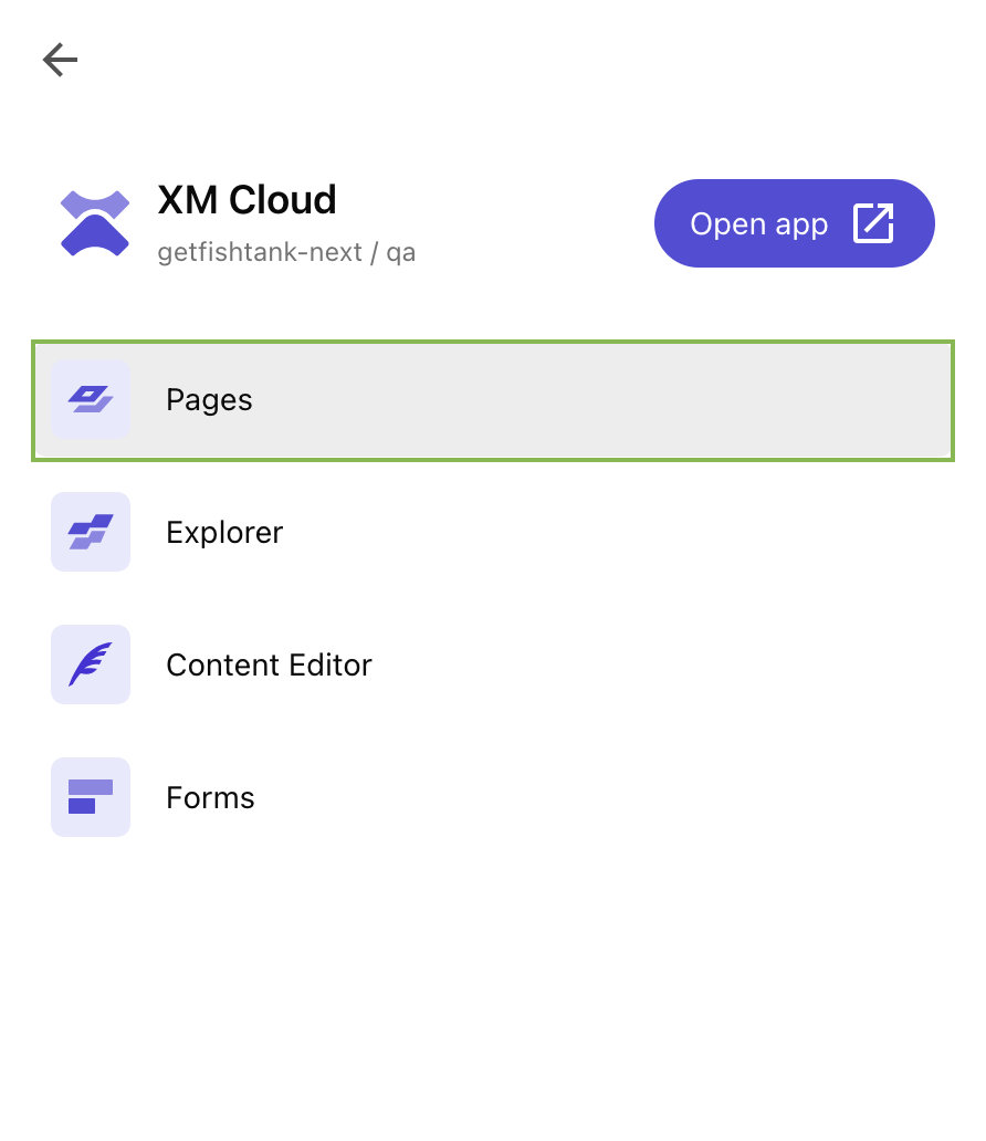
We can access XM Cloud Components through Sitecore Pages. You can do this through your organization’s Sitecore Cloud Portal.
-
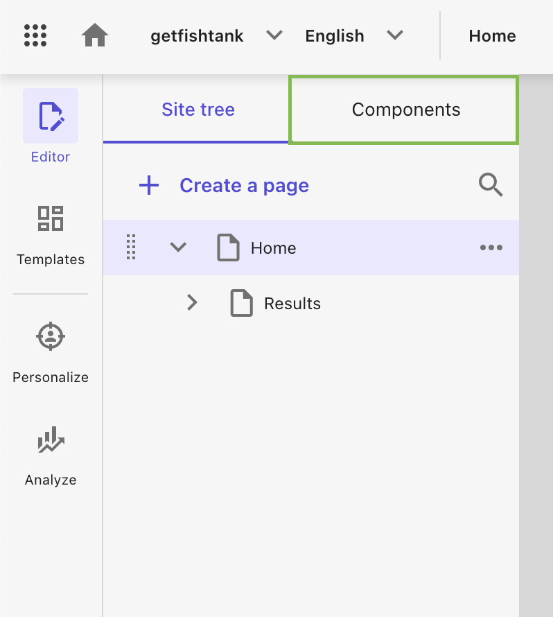
In the Editor tab, navigate to the top menu and click Components.
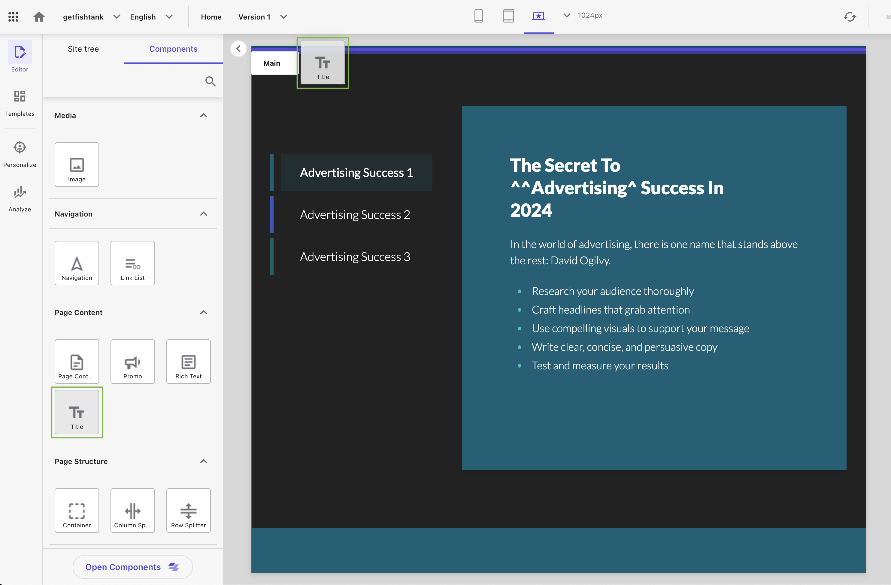
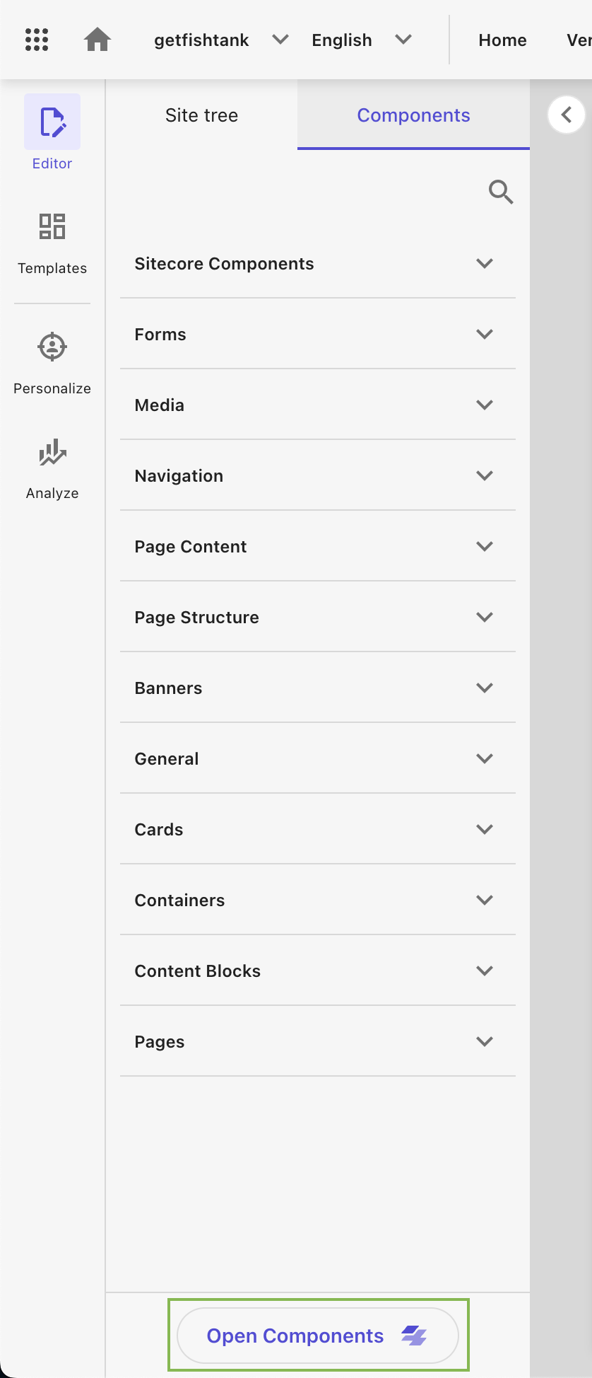
Here you’ll see several elements that you can drag and drop into your web page (e.g. forms, media, navigation, page content, page structure, banners, etc.). But for this blog we want to access XM Cloud Components.
-
Scroll to the bottom of the page and click Open Components.
-
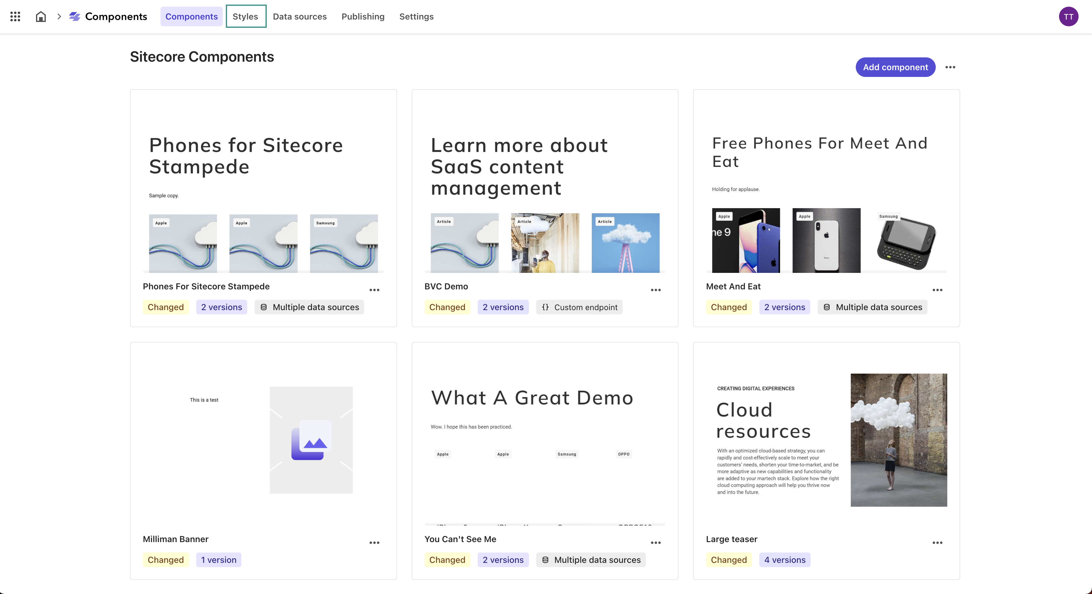
You’ll see the Sitecore Components dashboard with some out-of-the-box components already built. Navigate to the Styles tab in the top menu.
-
Here we will see the Sitecore Components Styles library and all of the different elements we can define within it.
Configuring Basic Styles in Sitecore XM Cloud Components
In this first part of our series, we've laid the groundwork by exploring what the Style Library in Sitecore XM Cloud Components is and why it's so important.
With a solid understanding of the foundational concepts and how to access the tool, you’re ready to move on to the next step. In Part 2 — Defining Your Styles Library in Sitecore XM Cloud Components, we will guide you through configuring the basics in the Styles Library. This will help you establish a robust system of design primitives and style rules.
Join us as we continue to build upon this knowledge and further enhance your ability to create visually consistent and brand-aligned digital properties.
Until next time, happy styling!
TL;DR — Sitecore XM Cloud Components Styles Library
The Styles Library is a tool that allows you to define and manage fonts, colors, graphics, breakpoints, and style rules for your websites in Sitecore XM Cloud Components.
By organizing these elements into consistent themes and applying them across text, inline, and block components, you can deliver cohesive, responsive, and on-brand user experiences.
This systematic approach streamlines the design process, enhances visual consistency, and supports efficient, scalable design practices.


