Different Options for Authors to Style Renderings
When working with Sitecore components, we can come across scenarios where we need to set up styling customization options for the authors to play around with, whether is choosing something simple as a background color, padding and margin, or more complex styles custom tailored to the project you are working on. In this blog, we will briefly talking about Styling and Advance Styling, two sections found on the right side panel of the Sitecore XM Cloud’s Page Builder where we as developers can take advantage of to add control and flexibility for authors to set how the renderings are presented on our websites.
Styling
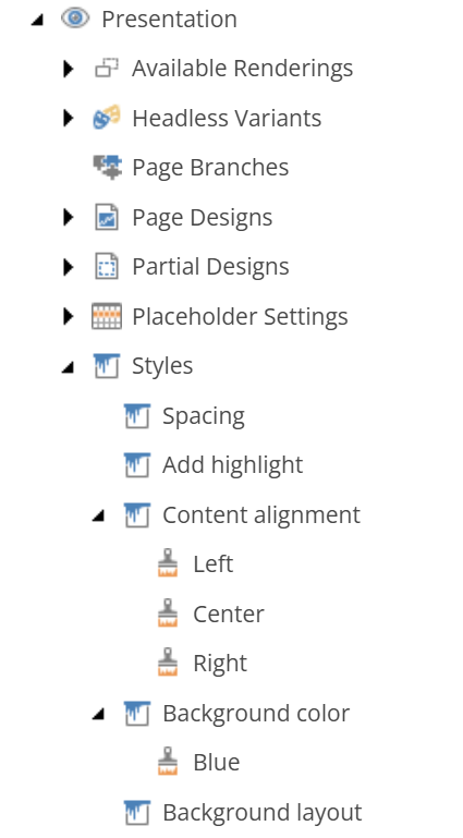
Out of these two, the most straightforward way to add some flexibility to specific styling to a rendering would be using the section called Styling on the Page Builder. In order to start setting this up, you need to find the Styles item on the Content Editor, which you can find under the project site, in Presentation > Styles. This allows us to very intuitively add variations to specific styling (such as spacing, alignment, colours, etc.) to an existing Rendering.
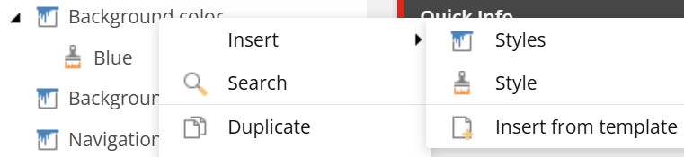
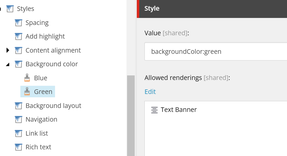
On Styles, simply right-click it and select Insert. At first, you would need to add the Styles you would like to add the Style variation into. In this case, let’s focus on the Styles already added called Background color, which right now has the Blue variation already inside. So you’d need to right-click the Background colour Styles, select and Insert and then Style. Let’s add a Green variation now.
When you have chosen the name for the Style, set a value such as this one below (this syntax will help us extract the value in Next.js). Afterwards, you need to then go to Allowed renderings and choose the Rendering you would like to add this Background color style to. In this case, it’s a simple Text Banner rendering used in this specific project.
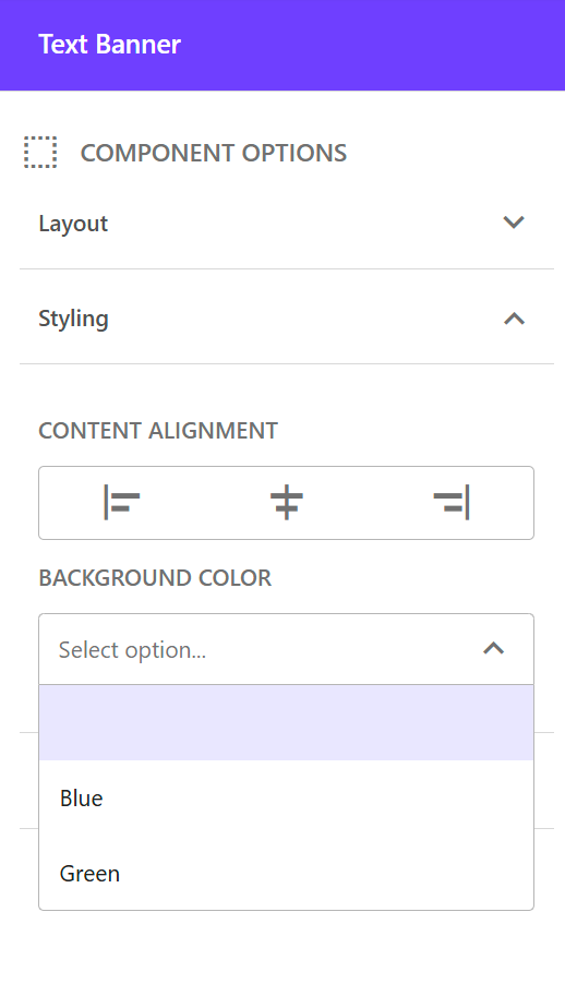
Once this is set up on the Content Editor, you can go to the Page Builder and select the rendering with this Styling variation. On the right you should see the Styling accordion menu where it has the selections for all the different Styles applied to this specific Rendering. As you see in the image, the Text Banner rendering has the options to style the Content Alignment as well as the Background Color, where if we open up this dropdown, we can see our newly created Green Style variation. We can select it now and the setup for this new Styling variation on Sitecore XM Cloud is complete. We now need to set up the styles on the Next.js component using this variation data.
In the TSX file for the TextBanner rendering, we will need to use the the params coming in the props for the rendering component. There we could extract the Styles applied with the help of the syntax we used earlier, which in this case is backgroundColor:green.
const TextBanner: React.FC<TextBannerProps> = (props) => {
const styles = props?.params?.Styles
let stylesObj = JSON.parse(`{${
styles
?.split(' ')
.map((style) => `"${style.split(':')[0]}":"${style.split(':')[1]}"`)
.join(',') || ''
}}`);
return (
<div className={
[stylesObj?.backgroundColor === 'green' && 'bg-green-500',
stylesObj?.backgroundColor === 'blue' && 'bg-blue-500'
]
.filter(item => item).join(' ')
}>
This is a Text Banner
</div>
);
}
Once this is rendered, the banner uses either bg-blue-500 or bg-green-500 based on the Style set up through the Page Builder. As seen in this example, this can apply to any type of styling, not just the rendering Background color.
Advance Styling
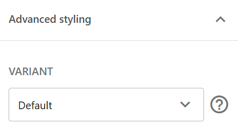
Similarly to Styles, on the Advance Styling option on Page Builder we can set up different custom controls that allow the authors to control how the rendering can look on the website. In this section we can find the dropdown for the Variants selection of the rendering as well as extra Parameters that can be set in place for custom styling configuration.
Let’s quickly take a look at a rendering of a Hero Banner used on a website as an example which will help us explain how to set up both of these Advance Styling options on the Page Builder and how they can be useful.
Variants
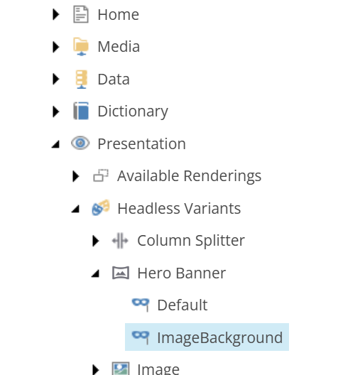
Starting with the Variants, as it name implies, gives the option to use variants of the of the same rendering. To use a Variant on the Page Builder, we must first set it up in the Content Editor. To do this, you need to navigate to the project site and find the Headless Variants item under Presentation > Headless Variants. There we can right-click and insert new Variants, in this case we name it Hero Banner since it will be used for the HeroBanner rendering.
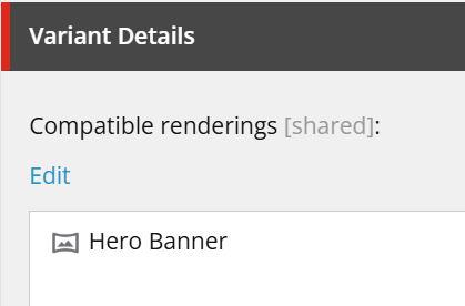
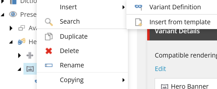
There, we need to set up the Compatible renderings under the Variant Details, which in this particular case it will only be the Hero Banner rendering. After this is done, we can start adding the Variant Definitions. We do this by right-clicking the rendering and selecting Insert > Variant Definition.
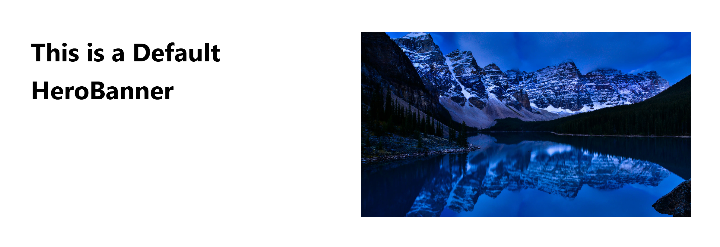
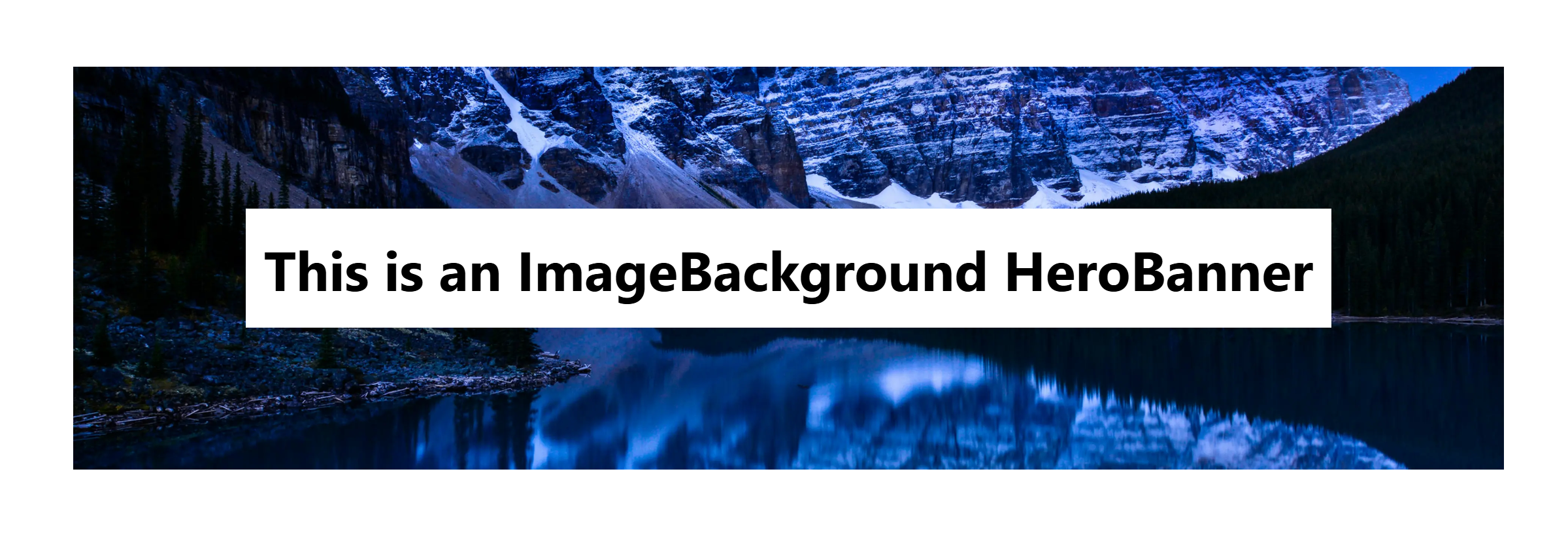
We will set up two variants, a Default one, which will be a Hero Banner split in half, with some text on one side and an image on the other. The other variant will be called ImageBackground and will have the image as a background instead, while the text floats on top of it. For these variants to work with our Next.js code we need to make note of the exact Variant name we are using aside from the Default one. Once you have set this, your tree should look something like this below:
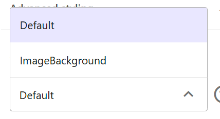
Once these are set up on the Content Editor, we can now go to the Page Builder, select our Hero Banner rendering and check that right-side panel, inside the Advance Options accordion to find these newly created Variants.
The last thing we need to do is to set up the Next.js code that will allow both of these rendering variants to be selected and shown properly on the front end. For this, we need to go to the component file for this rendering, which in this case it’s the HeroBanner.tsx file. The only thing we need to do is to have an exported function that returns each one of the React components needed, in this case, one for the Default variant and one for the ImageBackground variant.
import { ImageField, NextImage } from '@sitecore-jss/sitecore-jss-nextjs';
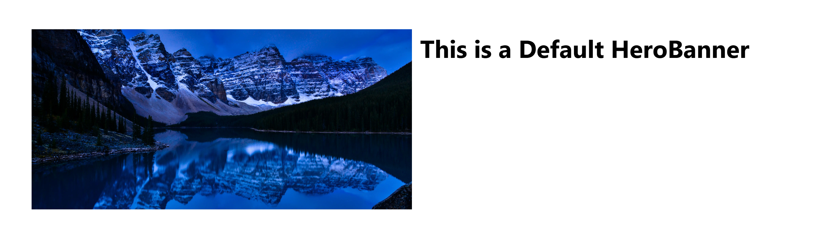
export const Default: React.FC<HeroBannerProps> = (props) => {
return (
<div className="flex h-120 w-full items-center gap-4 p-16">
<div className="h-full w-1/2 bg-white">
<h1 className="text-5xl font-bold">This is a Default HeroBanner</h1>
</div>
<div className="h-full w-1/2">
<NextImage field={props?.fields?.backgroundImage} className="h-full w-full object-cover" />
</div>
</div>
);
};
export const ImageBackground: React.FC<HeroBannerProps> = (props) => {
return (
<div className="relative flex h-120 w-full items-center p-16">
<div className="h-full w-full">
<NextImage field={props?.fields?.backgroundImage} className="h-full w-full object-cover" />
</div>
<div className="absolute left-0 top-0 flex h-full w-full items-center justify-center">
<div className="bg-white p-4">
<h1 className="text-5xl font-bold">This is an ImageBackground HeroBanner</h1>
</div>
</div>
</div>
);
};
type HeroBannerProps = {
fields: {
backgroundImage: ImageField;
};
};
This code will result in the Variants to display either the Default variant, with the text to the left and the image to right, or the ImageBackground variant, with the image used as a background and the text floating on top of it.
Default
ImageBackground
You can read more about how to create Variants on this in-depth blog entry called How to Create Rendering Variants in Sitecore XM Cloud with Next.js by John Flores.
Parameters
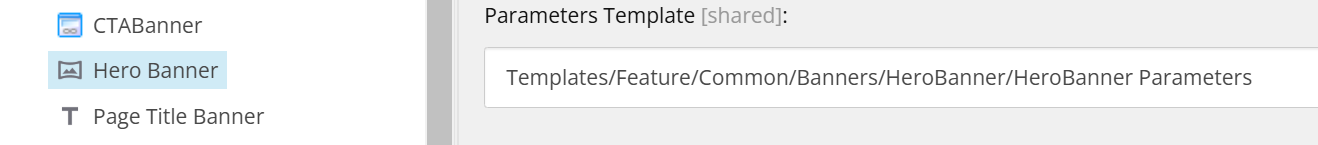
As mentioned above, we could also add some extra parameters to the rendering that we can use for controlling what content is presented and how this content is presented on the front end. To do so, you need to add the Parameters item in the same folder where the template used for the rendering is at. In this case, we will use a checkbox that will control if the content presented on this component, called HeroBanner, is flipped or not, but you can use this as any other field type, similar to how the fields for the template itself are set up.
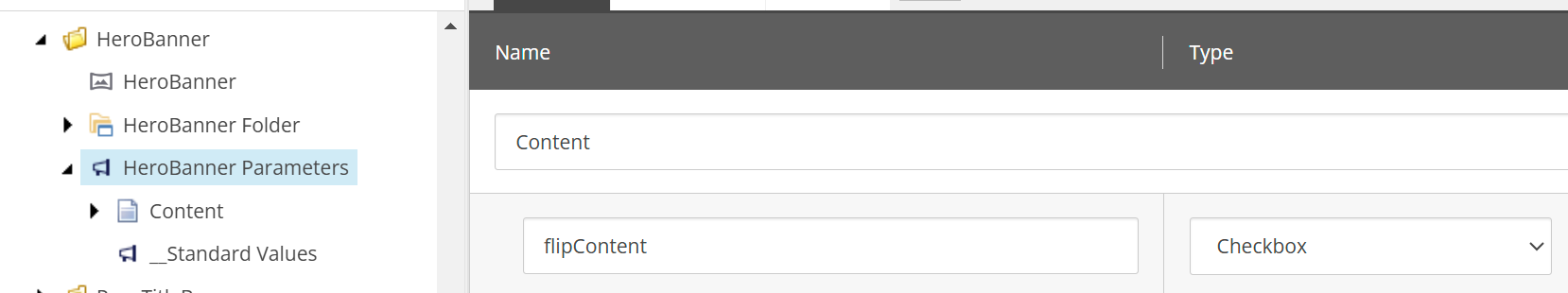
Afterwards, you need to make sure these parameters are linked to the rendering you are using, in this case the HeroBanner, under Editor Options > Parameters Template.
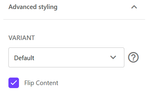
You can go now to the Page Builder and click on the rendering you are adding this Parameter to. On the right panel, under the Variant dropdown selector we used previously, you can find this new field, alongside with any other Parameter set up on the same rendering.
After this, all that is left is to set up the code to use this data in order to present the different versions of the rendering, in this specific case, flipping the content to either the left or the right. These parameters are found inside the props received by the Next.js component of the rendering. Let’s take a look at the same example we used above for the Default Hero Banner Variant, and let’s extend its styling by adding the ability for authors to flip content to either left or right.
import { ImageField, NextImage, ComponentParams } from '@sitecore-jss/sitecore-jss-nextjs';
export const Default: React.FC<HeroBannerProps> = (props) => {
return (
<div className={[
"flex h-120 w-full items-center p-16 gap-4",
props?.params?.flipContent ? 'flex-row-reverse' : 'flex-row',
].join(' ')}>
<div className="h-full w-1/2 bg-white">
<h1 className="text-5xl font-bold">This is a Default HeroBanner</h1>
</div>
<div className="h-full w-1/2">
<NextImage field={props?.fields?.backgroundImage} className="h-full w-full object-cover" />
</div>
</div>
);
};
type HeroBannerProps = {
fields: {
backgroundImage: ImageField;
};
params?: ComponentParams & {
flipContent: boolean;
};
};
After this change is set, if we go back and check the website, with the flipContent checkbox set to true, the text is now seen on the right and the image on the left and by setting it to false, the content returns to its original position.
Again, aside from a simple checkbox, by levering the field types Sitecore provides for us on the Content Editor, the possibilities for how to use these parameters are almost endless, which makes this a powerful tool that we can use in order to provide better control to authors on the Page Builder with pre-defined front end solutions on our Next.js project.
Which Approach Should You Choose?
Choosing between these approaches depends on the scope of the rendering and how much level of flexibility to the configuration is needed for these renderings on the Page Builder. Both Styling and Advance Styling sections on the Page Builder can be great options for developers to give authors some level of control over the presentation of the renderings whether is a very focused styling aspect (such as a background color of a component) or more advanced and somewhat “open-ended” solutions where we can have more moving parts to be controlled on the code while using either Parameters to fine-tune the component or Variants, where we could use a different version of the component altogether.