Defining Your Style Library in Sitecore XM Cloud Components
Welcome back to the second part of our series, outlining your style library in Sitecore XM Cloud Components.
Now that you understand what the Style Library is and its importance from Part 1 of our series, Intro to the Style Library in Sitecore XM Cloud Components, it’s time to explore the practical aspects of defining and organizing your Styles Library. In this blog, we’ll walk you through the steps of setting up design primitives and creating style rules, ensuring that your library is well-structured and ready to be applied consistently across all components.
Let’s get started on building a strong foundation for your design system. Defining basic primitives such as fonts, colors, graphics, and custom breakpoints is a critical step in the website design and development process. These elements form the foundation of a website or application's visual identity and functionality.
Let’s get started!
Adding Google Font Styles
Typography is not just about selecting attractive fonts; it’s a strategic element that significantly impacts brand recognition, readability, accessibility, and overall design cohesion. By defining the fonts to be used across all your styles, you ensure a consistent, professional, and user-friendly experience that reinforces your brand identity and enhances the effectiveness of your web components.
Here are some benefits of defining component font styles:
| Benefit | Description |
|---|---|
| Uniformity | Using a defined set of fonts ensures text is consistent across all pages and components, creating a cohesive look and feel. |
| Branding | Fonts play a significant role in establishing and reinforcing brand identity. A well-chosen font can convey the brand’s personality and values effectively. |
| Readability | Defined fonts ensure that text is easily readable across different devices and screen sizes, improving the overall user experience. |
| Accessibility | Consistent use of accessible fonts ensures that the content is readable for users with visual impairments, complying with accessibility standards. |
| Optimized Loading | By predefining fonts, especially web-safe and web-optimized fonts, loading times can be minimized, enhancing performance. |
To add a Google font to your Sitecore Components Style library:
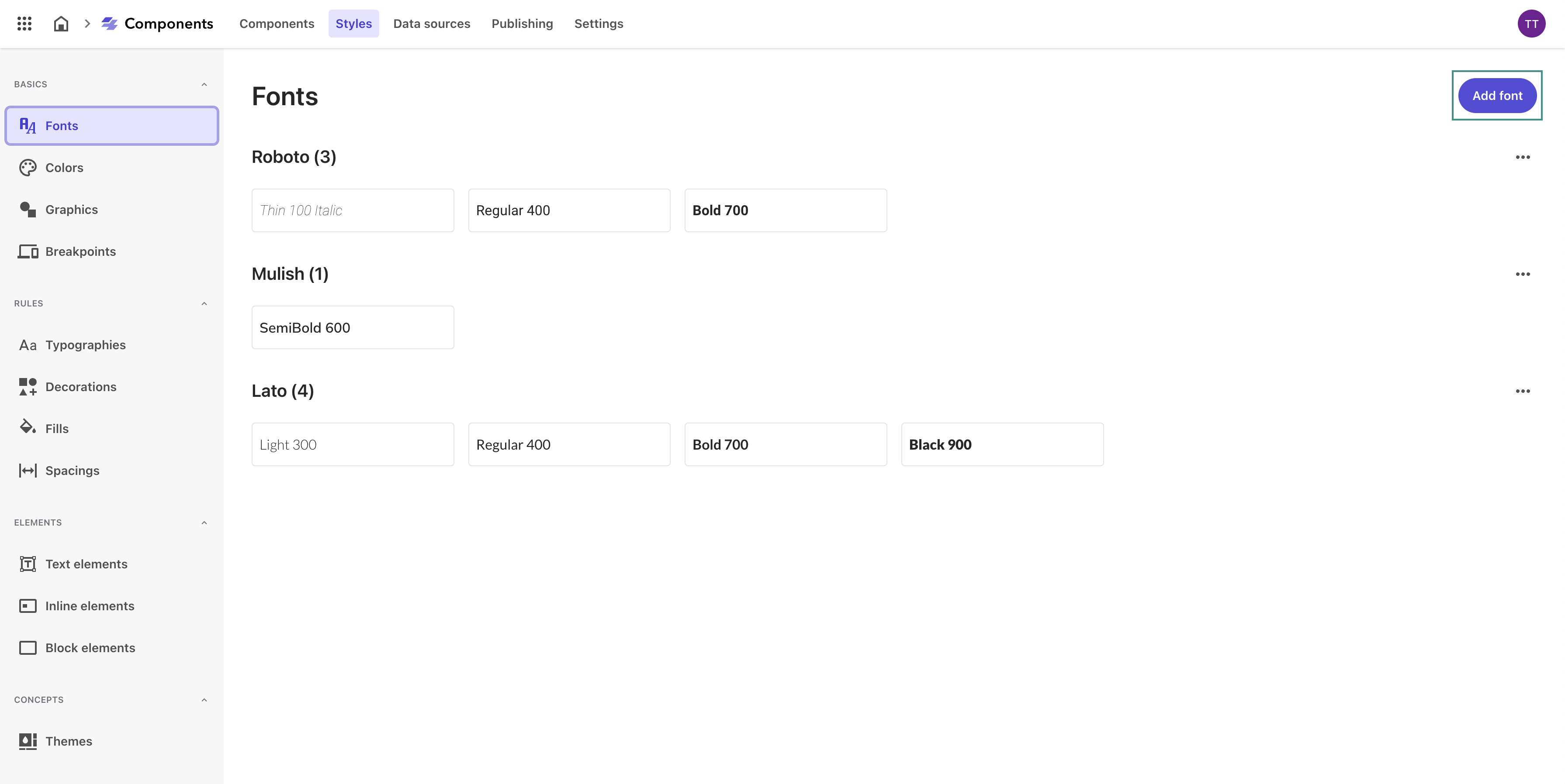
- Navigate to the Fonts tab in the left Styles menu.
-
Click Add font in the top right corner to add a new font.
-
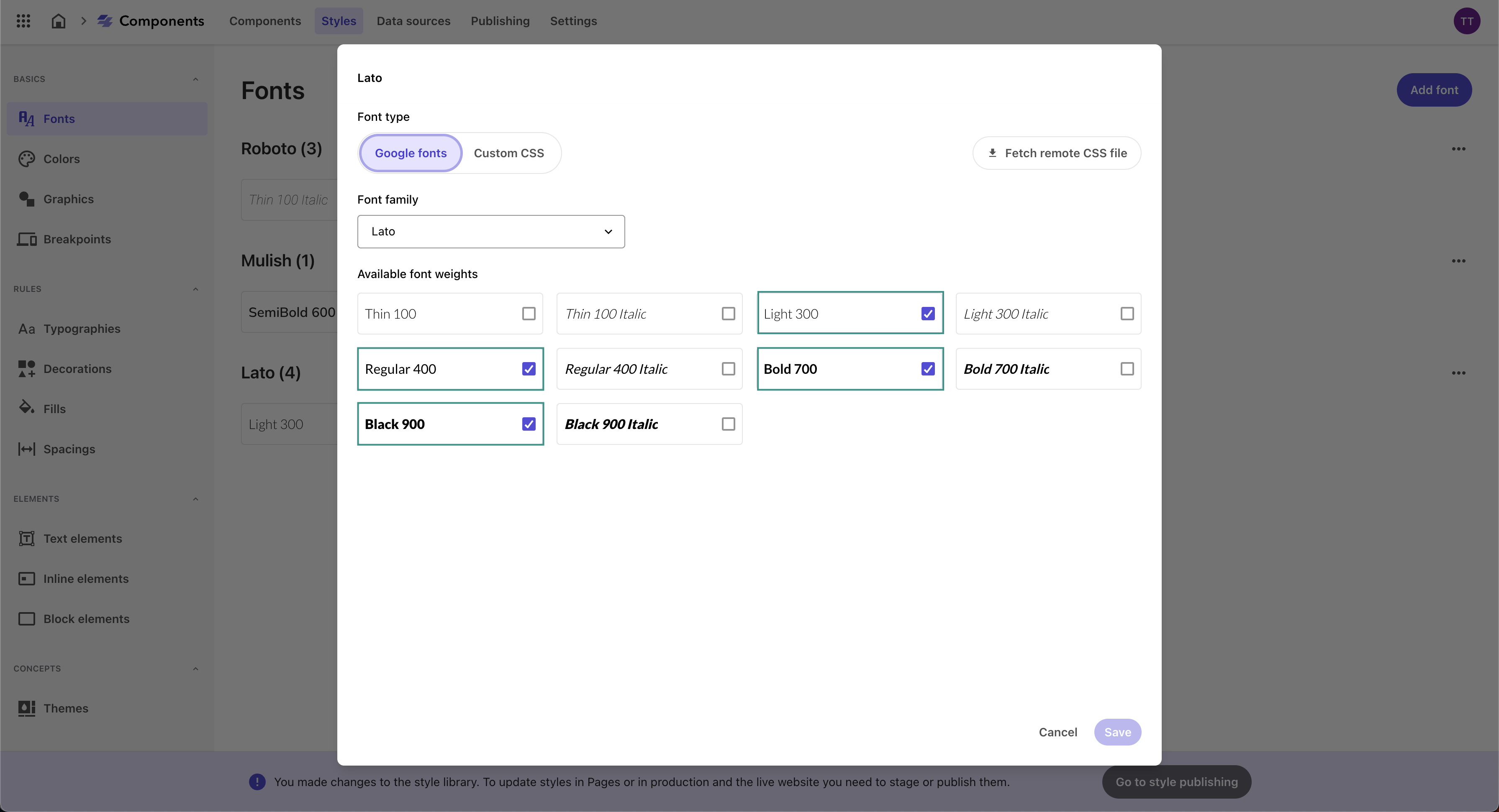
Under Font type, ensure Google fonts is selected.
- Under Font family, select the relevant font you want to add.
-
Select the Font weights you want to enable from the available list of font weights.
-
Click Save.
- Repeat for each Google font you want to add to the Styles library.
Adding Color Styles
Defining and organizing your brand colors is essential for building a strong, consistent, and recognizable brand identity. By carefully defining primary and secondary brand colors, creating thematic and functional collections, and ensuring consistency and accessibility, you can effectively manage your brand’s visual identity. This process enhances brand recognition and improves the overall user experience by providing a visually coherent and engaging interface.
Here are some benefits of defining component color styles:
| Benefit | Description |
|---|---|
| Visual Hierarchy | A well-defined color palette helps in creating a visual hierarchy, guiding users’ attention to the most important elements. |
| UI Design | Colors are crucial in UI design for buttons, links, and other interactive elements, helping users understand functionality and navigate intuitively. |
| Brand Colors | Consistent use of brand colors across all components strengthens brand recognition and trust among users. |
| Emotional Impact | Colors evoke emotions and set the tone for the user experience. A well-chosen color scheme can make the interface more engaging and pleasant. |
| User Engagement | Appropriate color choices can enhance user engagement by making the interface visually appealing and easier to interact with. |
To create a new color collection in your Sitecore Components Style library:
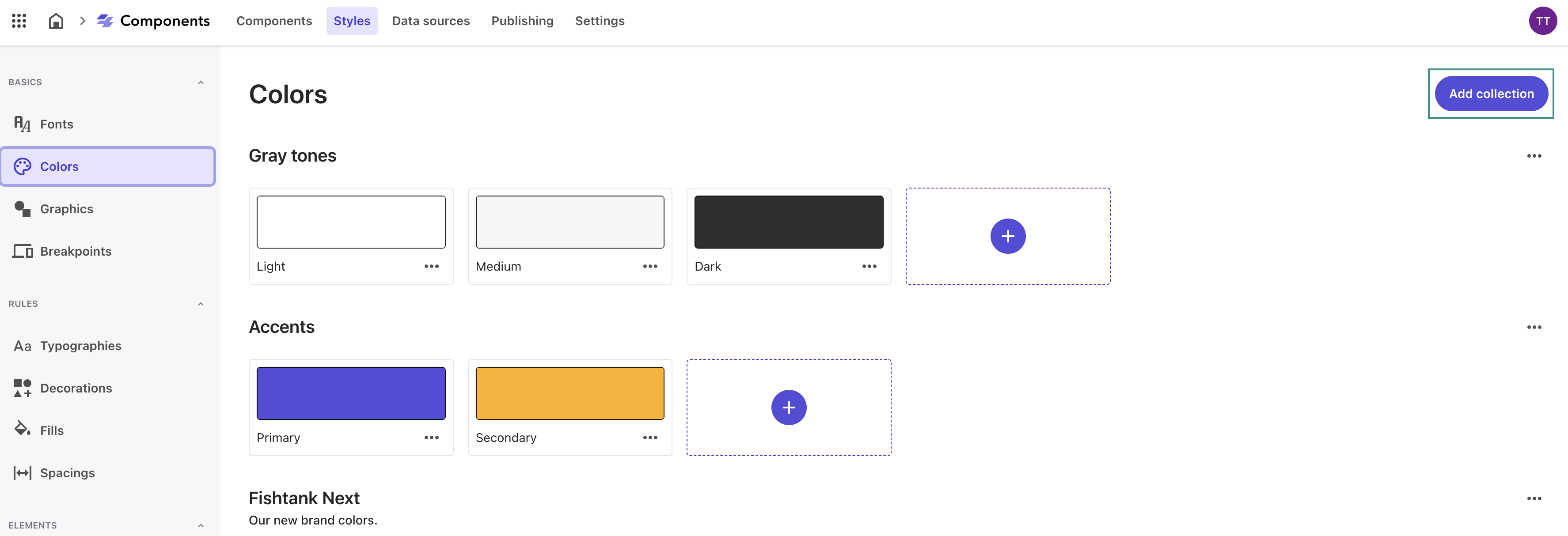
- Navigate to the Colors tab in the left Styles menu.
-
Click Add collection at the top right corner of the page.
-
Name your new color collection and click Save.
To add a color to your newly created collection in your Sitecore Components Style library:
-
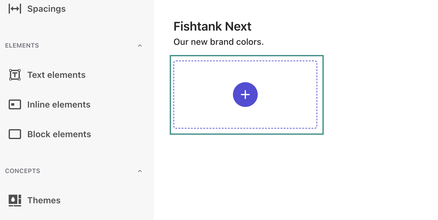
In a color collection, click (+).
-
Give the new color a unique Name and select a Collection from the dropdown.
- Select either HEX or RBG for the color Type you want, and enter the value of the new color.
- Set your opacity.
-
Click Save.
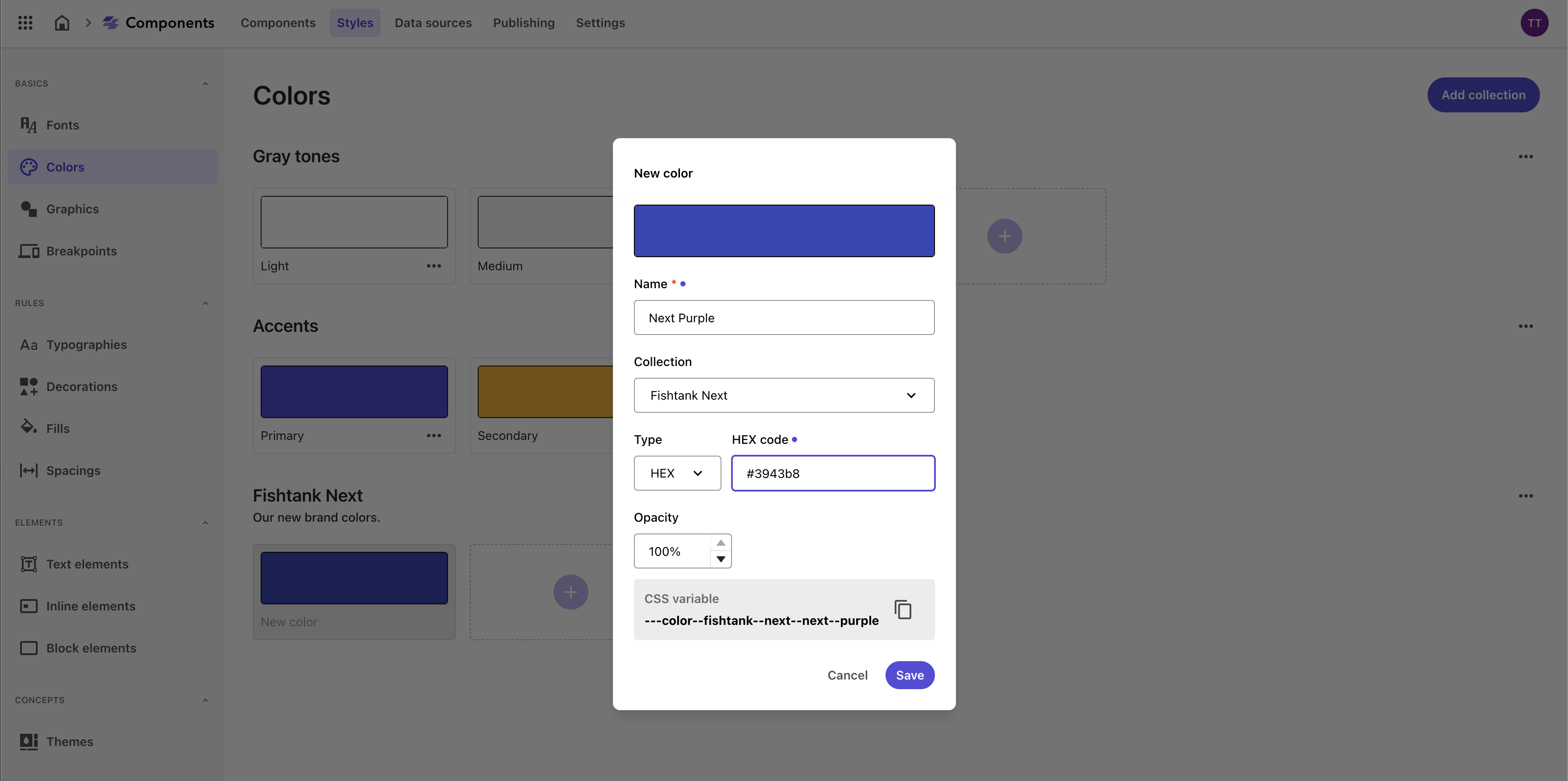
You can now apply the color collection in style rules, with each color saved in the CSS for use in the Components builder.

To copy the CSS variables, hover over a color in the Styles library and click CSS variables.

Adding Graphics
Defining graphics in the Styles Library ensures that all visual assets, such as logos and icons, are consistently used across your digital properties, reinforcing brand identity and maintaining a cohesive visual appearance.
Here are some benefits of defining component color styles:
| Benefit | Description |
|---|---|
| Visual Appeal | High-quality, consistent graphics enhance the visual appeal of the application, making it more attractive to users. |
| User Experience | Graphics can aid in storytelling, making the user experience more engaging and interactive. |
| Brand Consistency | Consistent use of graphics, such as logos and icons, across the application reinforces brand identity and ensures a professional look. |
| Optimized Graphics | Predefined graphics can be optimized for web use, ensuring faster loading times and better performance. |
To create a new graphics collection in your Sitecore Components Style library:
- Navigate to the Graphics tab in the left Styles menu.
- Click Add collection at the top right corner of the page.
- Name your new graphic collection and click Save.
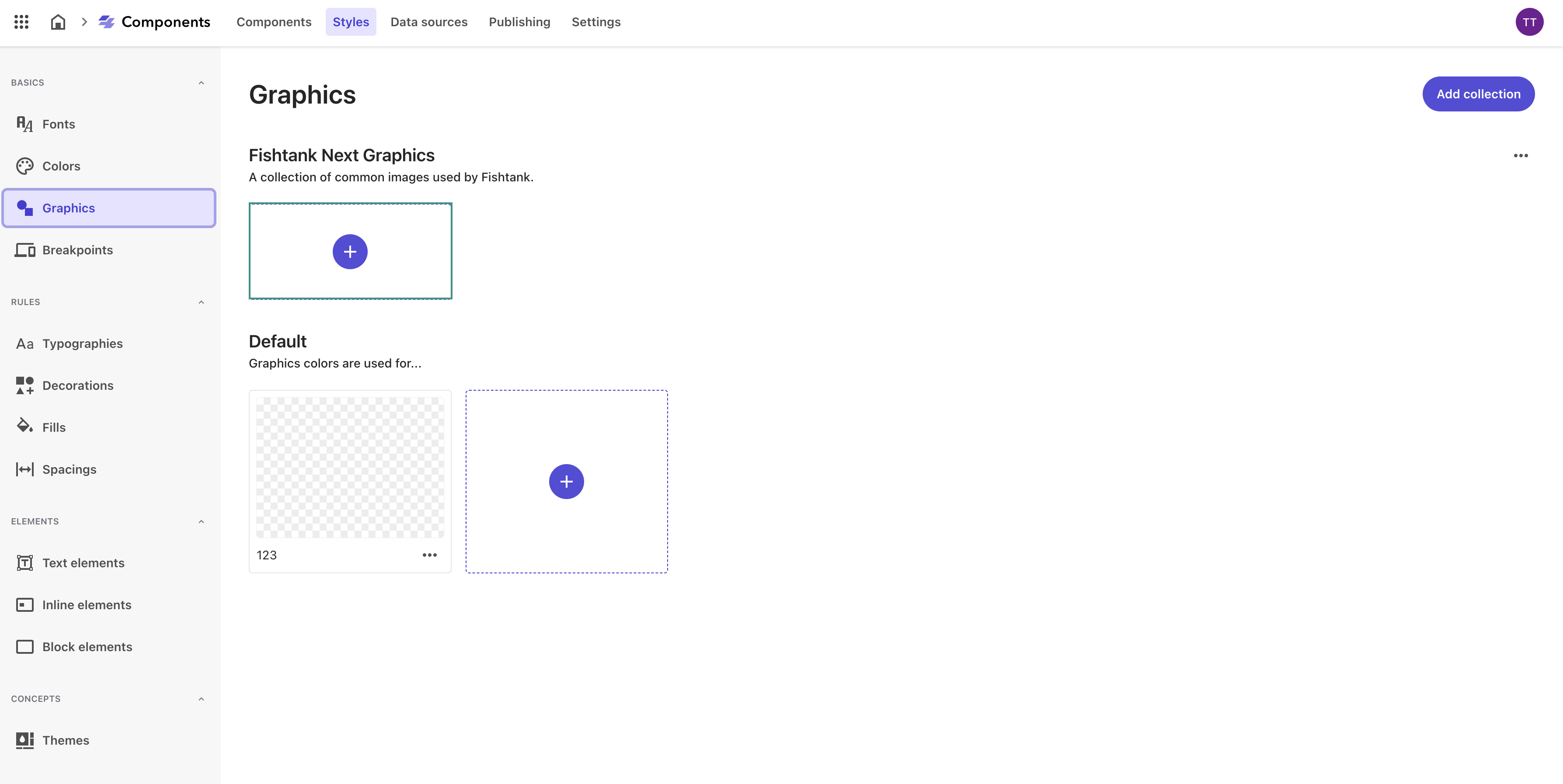
To add a graphic to your newly created collection in your Sitecore Components Style library:
-
In a graphic collection, click (+).
-
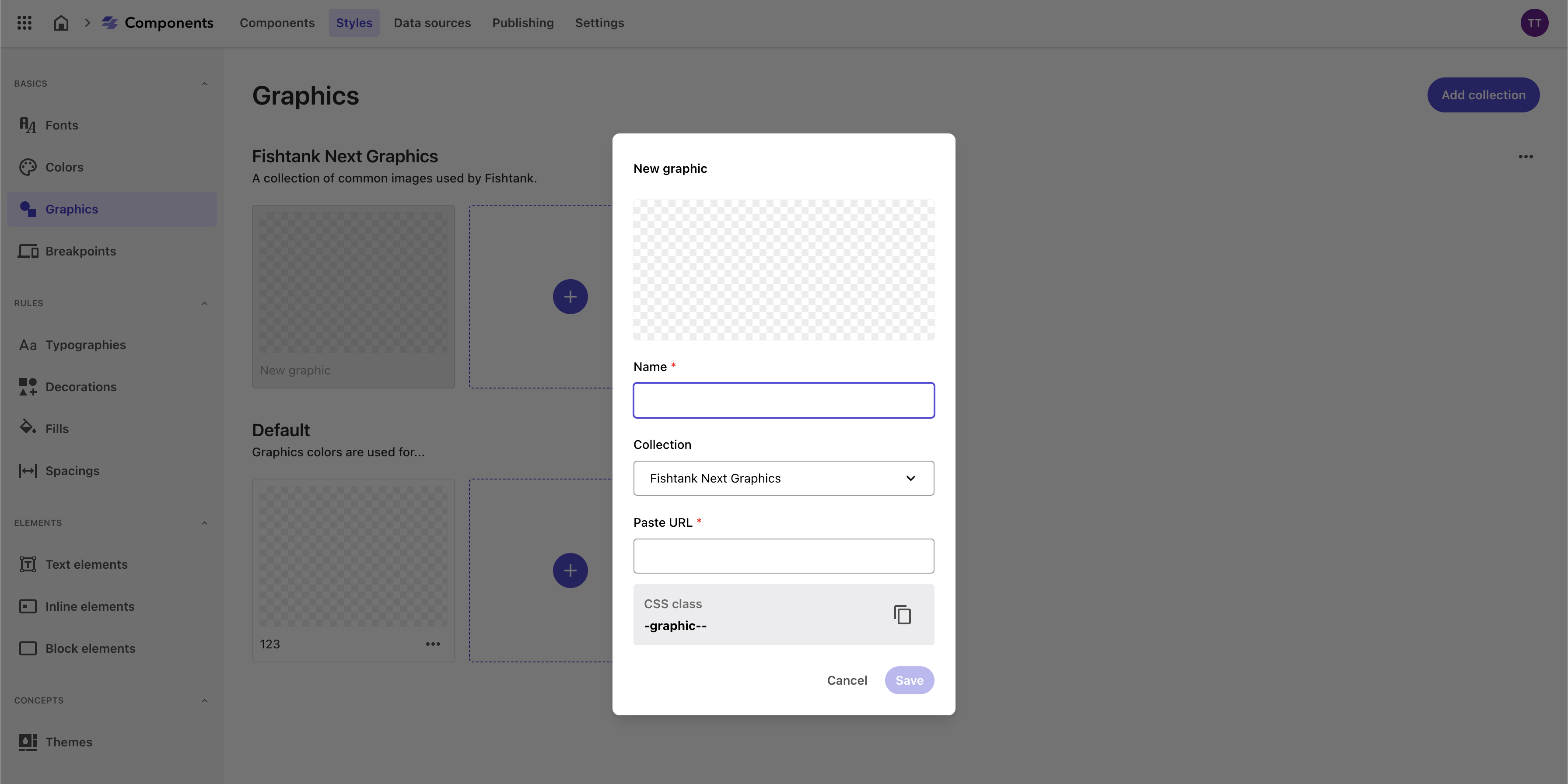
Name your new graphic and Paste the image URL.
-
Click Save.
Adding Breakpoints
Creating breakpoints is a fundamental aspect of responsive web design. They ensure that your website or application delivers an optimal user experience on all devices, from small mobile screens to large desktop monitors. By enhancing user experience, improving performance, increasing accessibility, and supporting better SEO practices, breakpoints play a critical role in the success of your digital presence.
Here are some benefits of defining component breakpoint styles:
| Benefit | Description |
|---|---|
| Responsive Design | Custom breakpoints ensure that the application looks and functions well on all devices, from mobile phones to large desktop screens. This flexibility is crucial for providing a seamless user experience across different devices. |
| User Experience | By defining custom breakpoints, designers can ensure that content is presented in an optimal way, improving usability and accessibility. |
| Performance | Custom breakpoints allow for the loading of appropriate resources (such as images and scripts) based on the device, optimizing performance and reducing unnecessary data usage. |
| Design Flexibility | Custom breakpoints offer more control over how the layout adapts to different screen sizes, enabling designers to create unique and tailored user experiences. |
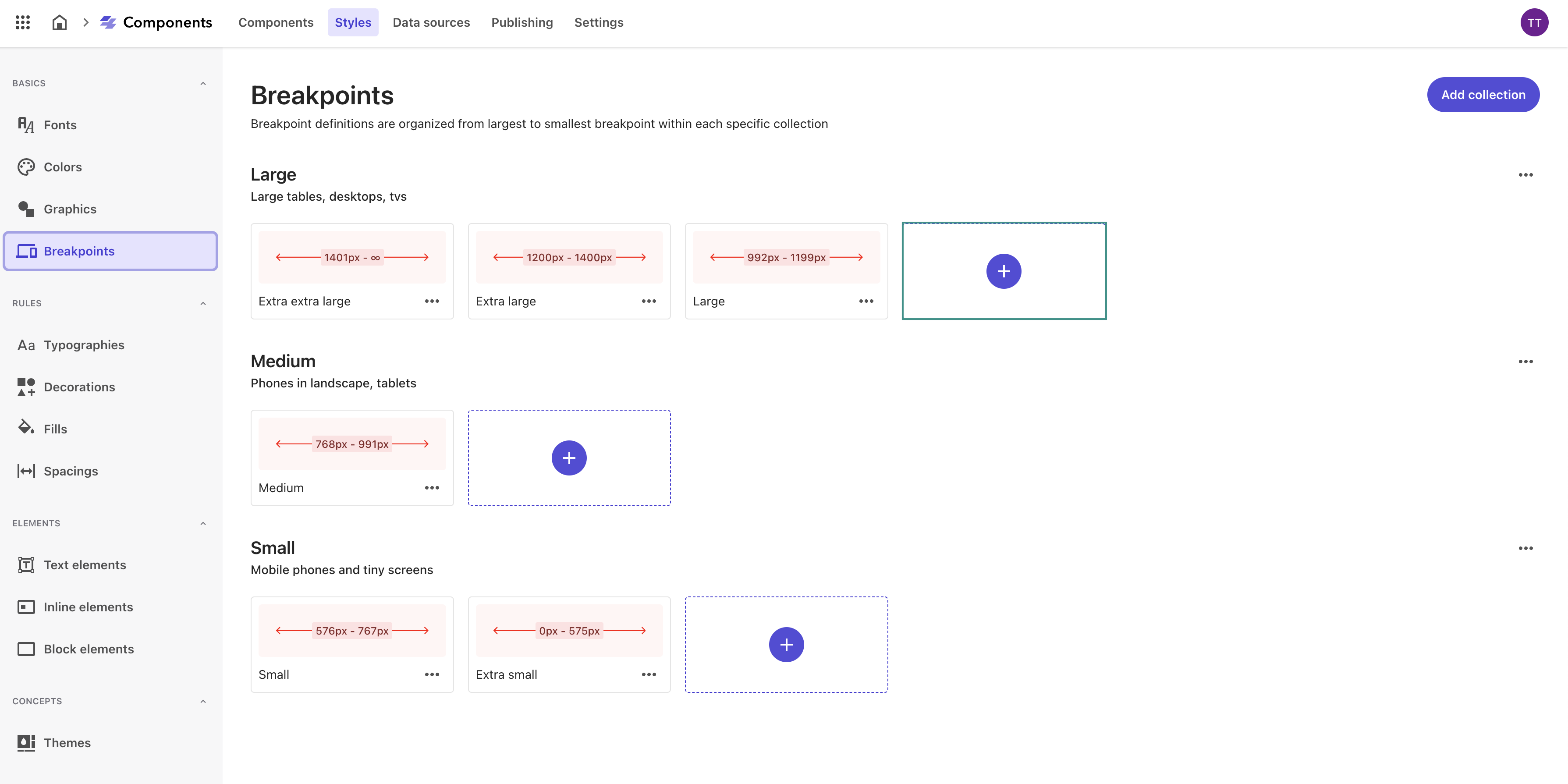
Here are the three collections out-of-the-box in Sitecore Components. You have the option to use one of these breakpoints or define your own. They will be sorted from largest to smallest breakpoint within each collection.
- Large — for large tablets, desktops, TVs
- Medium — phones in landscape, tablets
- Small — mobile phones and tiny screens
To create a new breakpoint collection in your Sitecore Components Style library:
- In the Styles builder, in the left pane, click Breakpoints.
- Click Add collection.
- Give a name to your collection, for example, Large, Medium, or Small.
- Click Save.
To add a breakpoint to your newly created collection in your Sitecore Components Style library:
-
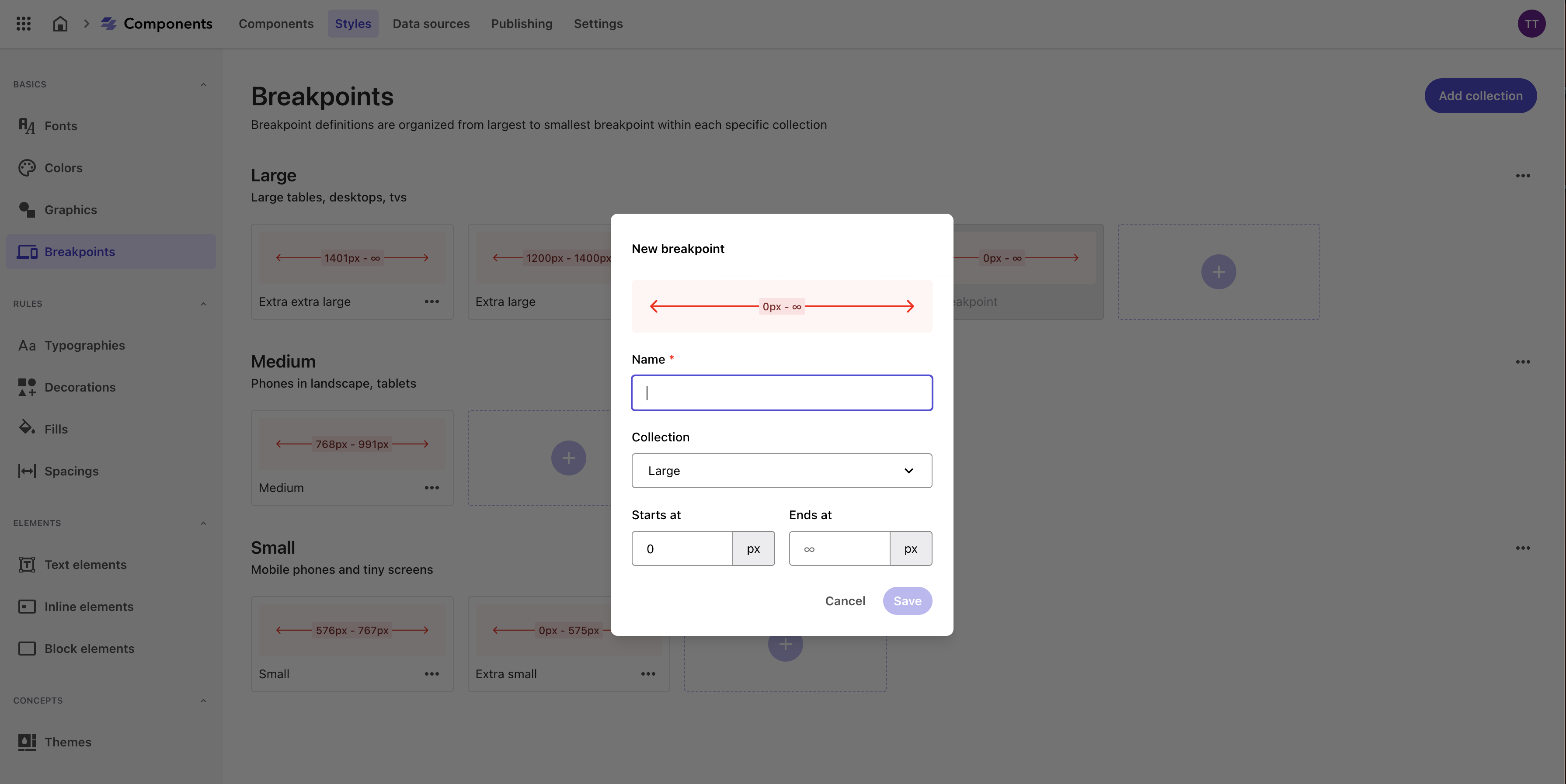
In the breakpoint collection, click (+).
-
Give a name to the breakpoint, for example, Extra extra large.
-
In the drop-down menu, click the collection the breakpoint belongs to.
- Define the starting and ending pixels. You can add as many breakpoints to a collection, as long as breakpoints don’t intersect. Otherwise, this will create issues when using responsive versions of a component in a webpage.
- Click Save.
Finalizing the Styles Library in Sitecore XM Cloud Components
In this second part of our series, we've covered the essential steps for defining and organizing your Styles Library in Sitecore XM Cloud Components. By establishing a solid foundation of design primitives and style rules, you're well-equipped to maintain visual consistency and brand integrity.
In the final part of our series, “Applying Rules to Elements in Sitecore XM Cloud Components”, we will show you how to apply these style rules to various elements, enabling you to bring your design system to life. Stay tuned as we conclude our journey by integrating these elements into your components for a cohesive and polished design.
Until then, happy styling!


