Introduction to Selectors, Pseudo-Classes, and Pseudo-Elements with Sitecore
If you’ve ever done any web development work, you’ll know that precise control over styling is super important for matching your Figma designs. Tailwind CSS has become a popular choice for component-based frameworks used when building Sitecore JSS websites. If you're just starting out with Tailwind, you might not realize how flexible it actually is. Tailwind provides you with easy ways to use advanced CSS techniques like child selectors, pseudo-classes, and pseudo-elements. These commonly used advanced CSS techniques allow us to easily target specific elements under targeted scenarios.
Child Selectors
Child Selectors in CSS
Child selectors allow you to target the direct child elements within a parent container. It’s another way to change the styling of a child item without needing to create a new CSS object to target the child item. The child selector (>) is very useful when you’re not using SASS or another CSS extension.
Example: Suppose you have a card component in your Sitecore JSS project, where only the direct child headings need special styling. You can successfully change the style of only the direct child items by using the Child Selectors.
Without child selectors
.card p {
    color: #3490dc; /* All p elements inside .card */
    font-size: 1.25rem;
}

.card p .sub-card p {
    font-size: 1rem; /* Just the p elements inside .sub-card */
}
With child selectors
.card > p {
    color: #3490dc; /* Only direct child p elements inside .card */
    font-size: 1rem;
}
Child Selectors in Tailwind CSS
With the recent release of Tailwind v3.4, Tailwind added native support for child selectors! You can now use * before your tailwind styles, and it will apply that style to all the children. Sadly, this functionality isn't as versatile as traditional CSS child selectors, since it will apply the styles to every child class. However, you can set a data value on your child elements and target them that way. This isn't a flawless workaround, but it does provide you with closer versatility to traditional CSS child selectors. You can also combine it with other Pseudo-class selectors like hover: allowing you to get extra utility out of your styles.
Tailwind Child Selectors
/* Applies css to all children */
<div className="*:text-gray-300 hover:*:text-blue-600">
/* HTML Goes Here */
</div>

/* Applies css to specific children with the correct data-slot */
<div className="data-[slot=description]:*:text-lg">
    <h2>...</h2>
    <p data-slot="description">...</p>
</div>
Pseudo-Classes
Pseudo-Classes in CSS
Pseudo-classes target elements in specific interaction states. Think: hover, focus, or active. This allows for dynamic styling that reacts to user interactions. These are very common and used all the time in modern CSS.
Example:
Imagine a button that changes colour when the user hovers over it. This is an easy thing to do in CSS if you use the hover Pseudo-class. If you didn't use it, you would need to use JS to accomplish the same thing.
Without Pseudo-Classes
/* HTML */
<button id="myButton" class="button">Hover me!</button>

/* CSS */
.button {
  background-color: #4a5568;
  color: white;
  padding: 0.75rem 1.25rem;
  border: none;
  cursor: pointer;
}

/* JS */
const button = document.getElementById('myButton');

button.addEventListener('mouseover', () => {
  button.style.backgroundColor = '#2d3748'; // Changes color on hover
});

button.addEventListener('mouseout', () => {
  button.style.backgroundColor = '#4a5568'; // Reverts color when not hovering
});
With Pseudo-Classes
/* HTML */
<button id="myButton" class="button">Hover me!</button>

/* CSS */
.button {
  background-color: #4a5568;
  color: white;
  padding: 0.75rem 1.25rem;
  border: none;
  cursor: pointer;
}

.button:hover {
  background-color: #2d3748; /* Changes background color on hover */
}
Pseudo-Classes in Tailwind CSS
Adding Pseudo-Classes in Tailwind is extremely simple and one of its best features. In traditional CSS (as seen above) you apply the Pseudo-class to the end of the element. In Tailwind you just prefix the utility class with Pseudo-class of choice!
You can also stack Pseudo-classes onto one tailwind class. So in specific situations where perhaps you want: a different hover effect on the :first-child - you can target it directly.
Tailwind Pseudo-Classes
Example code used above:
<button id="myButton" class="bg-gray-600 text-white py-3 px-5 border-none cursor-pointer hover:bg-gray-700">
  Hover me!
</button>
Other cool Pseudo-Class functionality:
/* Active link */
<a href="#" class="active:text-green-500 text-gray-700">Active Link</a>

/* Hover on parent to apply styles to child */
<div class="group">
  <button class="group-hover:bg-red-500 bg-gray-300 px-4 py-2 rounded">
    Hover me
  </button>
</div>

/* Odd/Even rows in a table */
<table class="table-auto border-collapse border border-gray-400">
  <tr class="odd:bg-gray-200">
    <td>Row 1</td>
    <td>Data 1</td>
  </tr>
  <tr class="even:bg-gray-200">
    <td>Row 2</td>
    <td>Data 2</td>
  </tr>
  <tr class="odd:bg-gray-200">
    <td>Row 3</td>
    <td>Data 3</td>
  </tr>
</table>

/* Nested/stacked pseudo-class */
<div class="group">
  <ul class="list-none group-hover:even:bg-red-300 group-hover:odd:bg-blue-300">
    <li class="px-4 py-2">
      Item 1
    </li>
    <li class="px-4 py-2">
      Item 2
    </li>
  </ul>
</div>
Pseudo-Elements
Pseudo-Elements in CSS
The Pseudo-elements, ::before and ::after, allow you to inject additional content before or after elements without adding new HTML elements. They are most commonly used to do things like adding icons, underlines, or accents. Some developers also use it a lot when working with lists (<li>).
Example:
In your Sitecore project, you want to add an underline beneath a heading as a decorative element.
Without Pseudo-Elements
/* HTML */
<h2 class="heading">Decorative Heading</h2>
<div class="underline"></div>

/* CSS */
.heading {
  font-size: 1.5rem;
  color: #333;
}

.underline { /* targets the new custom Underline div*/
  width: 100%;
  height: 2px;
  background-color: #e53e3e;
  margin-top: 4px;
}
With Pseudo-Elements
/* HTML */
<h2 class="heading">Decorative Heading</h2>

/* CSS */
.heading {
  font-size: 1.5rem;
  color: #333;
  position: relative; /* Required to position the pseudo-element */
}

.heading::after {  /* We can target the existing element */
  content: "";
  position: absolute;
  left: 0;
  bottom: -4px;
  width: 100%;
  height: 2px;
  background-color: #e53e3e;
}
Pseudo-Elements in Tailwind CSS
Pseudo-Elements work the same way as Pseudo-Classes in tailwind! You apply the Pseudo element to the beginning of your class. You can also stack Pseudo-Elements with Pseudo-Classes, allowing you to easily change stylings for different breakpoints or items.
Tailwind Pseudo-Elements
Example code used above:
<h2 class="heading relative text-lg text-gray-800 after:content-[''] after:absolute after:left-0 after:bottom-[-4px] after:w-full after:h-[2px] after:bg-red-600">
  Decorative Heading
</h2>
Other cool Pseudo-Element functionality:
<!-- Before pseudo-element to add a decorative icon -->
<div class="before:content-['🔥'] before:mr-2 flex items-center">
  Hot Item
</div>

<!-- After pseudo-element for a tooltip -->
<div class="relative group">
  <button class="px-4 py-2 bg-blue-500 text-white rounded">Hover Me</button>
  <span class="after:content-['Tooltip!'] after:absolute after:top-full after:left-0 after:mt-2 after:bg-gray-800 after:text-white after:px-2 after:py-1 after:rounded after:opacity-0 after:group-hover:opacity-100">
  </span>
</div>

<!-- Selection styling with gradient -->
<div class="mb-4">
  <p class="selection:bg-gradient-to-r selection:from-purple-500 selection:to-pink-500 selection:text-white">
    Highlight this text to see a gradient background applied to the selection.
  </p>
</div>

<!-- Placeholder styling for invalid input -->
<div class="mb-4">
  <input
    type="email"
    placeholder="Enter a valid email"
    class="placeholder:text-red-400 invalid:placeholder:text-red-600 border border-gray-300 rounded px-4 py-2 w-full"
  />
</div>
Using Custom Tailwind Classes in Sitecore
1. Sitecore: Tailwind & Style Buckets
In Sitecore XM Cloud, we can utilize the custom style buckets functionality to easily add custom Tailwind classes directly into Sitecore. The Style buckets allow your content authors to seamlessly change the CSS styling without making code changes directly in Sitecore. It's a great way to allow people with no CSS knowledge to make style changes to your Front-end.
Step 1
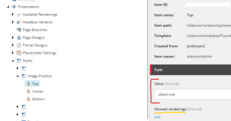
You need to locate the Styles root item under Presentation and create a new Style Controller; you should label it according to the Tailwind CSS that you're adding. For this example, I'm going to add the Image Position classes to my Style Controller.
Step 2
Next we want to create some child Style items. You want to create a new Style item for each of the style scenarios that you are creating. So for the Image Position example, we will want 3 Style items for Top, Center & Bottom.
Step 3
We want to insert the Tailwind CSS class(es) into the Value field of our Style items (see “Red” highlight in below image). This could also be any CSS class that you have in your global.css file.
Step 4 (Optional)
If you want to limit which authorable renderings have access to your Style, you can add it to the “Allowed Renderings” box on each Style. (See “Yellow” highlight in the image below).
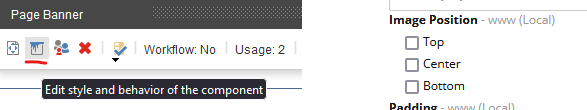
To add these Tailwind classes to your components and pages, you can open up the Experience Editor or Sitecore Pages and open the style bucket to apply your all the styles you've created.
2. Front-End: Accessing Sitecore Style Bucket Values
In my example, ill be using Next.js since its the JSS framework of choice here at Fishtank; however this concept will be easy enough to implement in Vue, Angular or any other Front end JavaScript framework.
Accessing the style values from Sitecore is actually super simple, inside our .tsx code we just need to access the props value provided to us directly from Sitecore. You should be able to find them in props.params?.Styles. If there are no styles selected in Sitecore, then this params value will be undefined.
If your author has selected multiple styles at once, then they will all be contained inside props.params?.Styles as a space delimited list. Assuming that all the Style values are valid CSS values, you can just apply them directly to your HTML elements.
<div>
    <Image
      className={`${props.params?.Styles} h-full max-h-56 w-full`}
      field={props?.fields?.image}
    />
</div>
If you want to split your styles between multiple HTML elements, you can add custom prefixes to your values and segregate them using JavaScript on your front end. However, I would recommend keeping the styling you provide to your authors limited, so avoid having bad UI/UX for your users and overly complex components for your developers.