Reading time: 5 min read
Implementing Custom Edit Frames for Experience Editor
Use Sitecore’s JSS EditFrame component to enhance Experience Editor for your clients
Start typing to search...
Use Sitecore’s JSS EditFrame component to enhance Experience Editor for your clients
When Sitecore projects need to be upgraded they can have their own challenges. For example, we are currently in the process of upgrading a client from Sitecore XP MVC to XM Cloud. This involves converting their MVC .NET solution to Next.js. In the .NET solution, they have custom edit frames, which was a challenge to support in Next.js.
However, we found that Sitecore offers an EditFrame JSS component that allowed us to maintain the functionality of their .NET solution in Experience Editor. EditFrame allows content authors to set values for fields they otherwise wouldn’t be able to set in Experience Editor.
For learning, let’s start with something simple.
We have a component with a Link field, allowing the author to set the value for the link in Experience Editor. There is also a conditional statement for the linkIcon field which determines which image to render, but it is not editable in Experience Editor.
import {Link} from '@sitecore-jss/sitecore-jss-nextjs';

...

<Link field={fields?.link} />;
{fields?.linkIcon?.value == "downloadIcon"
    ? <img src="../assets/downloadIcon.svg" />
    : <img src="../assets/arrowIcon.svg" />}
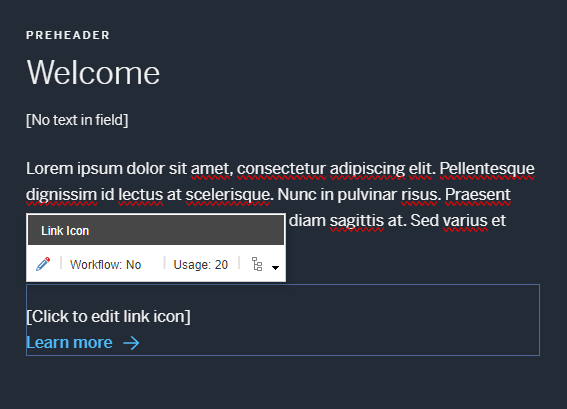
We want to give the content author the ability to change the value of linkIcon in Experience Editor. First, let’s add a simple prompt above the link.
import {Link} from '@sitecore-jss/sitecore-jss-nextjs';

...

<div>[Click To Edit Link Icon]</div>

<Link field={fields?.link} />;
{fields?.linkIcon?.value == "downloadIcon"
    ? <img src="../assets/downloadIcon.svg" />
    : <img src="../assets/arrowIcon.svg" />}
Then import the EditFrame component and wrap the prompt with it.
import { Link, EditFrame } from '@sitecore-jss/sitecore-jss-nextjs';

...

<EditFrame>
    <div>[Click To Edit Link Icon]</div>
</EditFrame>

<Link field={fields?.link} />;
{fields?.linkIcon?.value == "downloadIcon"
    ? <img src="../assets/downloadIcon.svg" />
    : <img src="../assets/arrowIcon.svg" />}
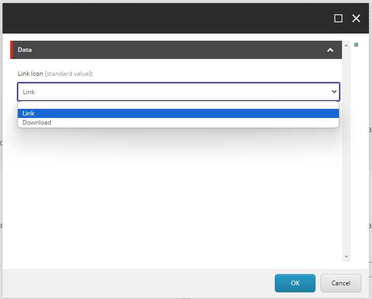
To make the edit frame component work with Experience Editor, we need to give it some information.
import { EditFrame, Link } from '@sitecore-jss/sitecore-jss-nextjs';

const editFrameButtons = [
  {
    header: 'FieldEditButton',
    icon: '/~/icon/Office/16x16/pencil.png',
    fields: ['linkIcon'],
    tooltip: 'Edit the link icon',
  },
];

const getEditFrameProps = (dataSource?: string) => {
  return {
    dataSource: dataSource
      ? {
          itemId: dataSource,
        }
      : undefined,
    buttons: editFrameButtons,
    title: 'Edit link icon',
    tooltip: 'Edit the icon link',
    cssClass: '',
  };
};

<EditFrame {...getEditFrameProps(fields.id)}>
    <div>[Click To Edit Link Icon]</div>
</EditFrame>

<Link field={fields?.link} />;
{fields?.linkIcon?.value == "downloadIcon"
    ? <img src="../assets/downloadIcon.svg" />
    : <img src="../assets/arrowIcon.svg" />}
This example follows the same structure as https://github.com/Sitecore/jss/blob/dev/packages/create-sitecore-jss/src/templates/nextjs-styleguide/src/components/styleguide/Styleguide-EditFrame.tsx, but can be refactored to suit your needs.
The two most important parameters are dataSource and buttons. The dataSource parameter holds the data source ID that the field belongs to. buttons is an array of button configurations. Each button object in the array should specify the fields that the edit button corresponds to. These buttons appear in the inline editing toolbar.
EditFrame is not supported in XM Cloud’s Pages yet. It will show up in Pages, but won’t be responsive. Until it’s supported, you’ll want to hide it. The cssClass property of the edit frame component comes in handy for this. Experience Editor editable fields use a class called scEnabledChrome, but Pages does not use this class, so we can create a simple style rule to hide the edit frame from Pages, and add that rule to the Edit Frame’s cssClass .
  //this is to hide edit frames in Pages, but not EE
  .hideInPages:not(.scEnabledChrome) {
    display: none;
  }
  ...

  const getEditFrameProps = (dataSource?: string) => {
    return {
      dataSource: dataSource
        ? {
            itemId: dataSource,
          }
        : undefined,
      buttons: editFrameButtons,
      title: 'Edit link icon',
      tooltip: 'Edit the icon link',
      cssClass: 'hideInPages',
    };
  };

  ...
the edit frame component should only be visible in edit mode, so be sure to wrap it in a check:
  ...

  {isEditMode &&
      <EditFrame {...getEditFrameProps(fields.id)}>
          <div>[Click To Edit Link Icon]</div>
      </EditFrame>
  }

  ...
Now when the author clicks on the custom edit frame in Experience Editor, they will be prompted to change the field.
The EditFrame component proved to be a powerful tool, enhancing Experience Editor by allowing content authors to edit fields that are otherwise difficult to set using other JSS components. By following the implementation steps, you can effectively integrate EditFrame into your Sitecore JSS projects, ensuring a seamless transition and maintaining a high level of functionality for your clients.