Adding Built-in Components in Sitecore XM Cloud Pages
Learn how to drag-and-drop built-in components in XM Cloud using the Sitecore Pages visual editor.
Learn how to drag-and-drop built-in components in XM Cloud using the Sitecore Pages visual editor.
Start typing to search...
In Sitecore XM Cloud Pages, "components" refer to pre-made, modular elements that offer certain functionality on a web page. These components are designed with flexibility and reusability in mind, with the intention of being reused across different parts of a website. This approach helps maintain consistency in design and functionality, makes the development process more efficient, and facilitates easier updates and maintenance. These elements could be anything from a text box or image gallery to a contact form or a search bar. Because they are modular, they can be added into different parts of a page as needed to build or customize its layout and features.
Components can be easily added, configured, and managed from within the Sitecore XM Cloud Pages interface. This allows organizations to save time and streamline the development process, and focus on delivering engaging and personalized digital experiences to their customers. The pre-built components and templates in Sitecore XM Cloud Pages provide a foundation for non-technical users to build high-quality digital experiences, while also enabling developers to add custom functionality as needed.
If you would like to explore the Sitecore Pages interface in XM Cloud, read our blog here.
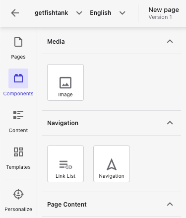
There are several different categories of components that can be used in multiple contexts or configurations across XM Cloud Pages. The out-of-the-box (OOTB) components included in XM Cloud Pages include are grouped in — Media, Navigation, Page Content, and Page Structure categories.
Components can include elements such as:
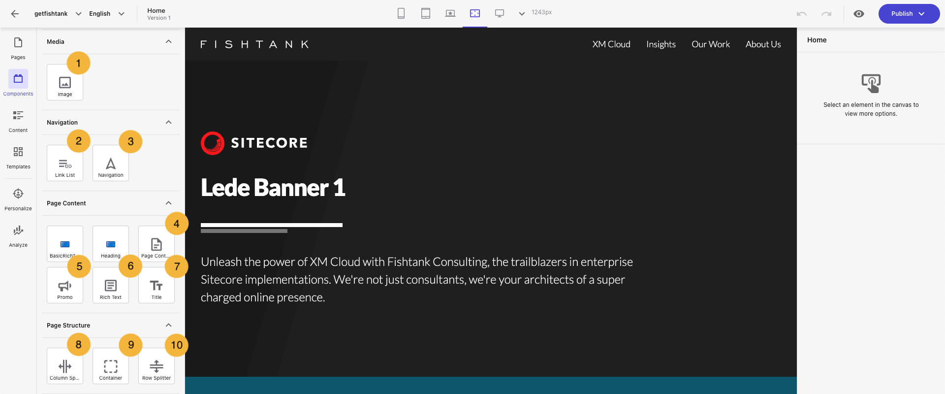
Let’s explore the different built-in components in XM Cloud with the following screenshot and table:
| XM Cloud Component | Description |
|---|---|
| Media | |
| 1. Image Component | Add images from the media library to a page. |
| Navigation | |
| 2. List Link Component | Add a list of items that display a title, link, and text. |
| 3. Navigation Component | Creates a navigation menu for your site. |
| Page Content | |
| 4. Page Content Component | Displays specific fields from a selected data source item on the page. |
| 5. Promo Component | Consists of an image, text, and link field, all of which need to be manually populated. All three will belong to the same content item, that gets assigned to the component. |
| 6. Rich Text Component | Add formatted text to the page using HTML tags. |
| 7. Title Component | Displays the title or subtitle of the current page. |
| Page Structure | |
| 8. Column Splitter Component | Divides the page into a number of specified columns, |
| 9. Container Component | Adds extra CSS styling to other components using a wrapper. |
| 10. Row Splitter Component | Divides the page into a number of specified rows. |
To add a components in XM Cloud, we will need to use the Sitecore Pages visual editor and its simple drag-and-drop functionality. Components are the building blocks for page layouts, and can also hold various content that we will be able to edit visually. The exact placement of a component will depend on the layout configuration of a page in Sitecore Pages, but it can be inserted:
Here you will learn how to create a new page and add components to the page.
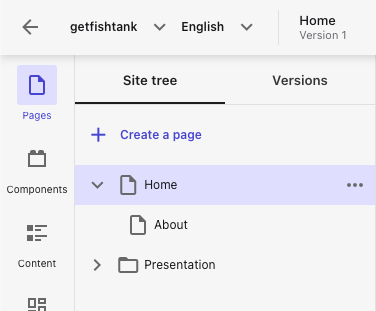
Navigate to the Pages tab in the left-side menu in Sitecore XM Cloud Pages, and click + Create a page.
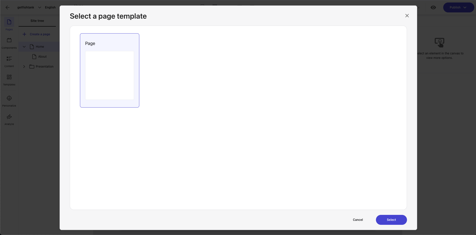
Choose the Blank Page template from the dialog box, and click Select.
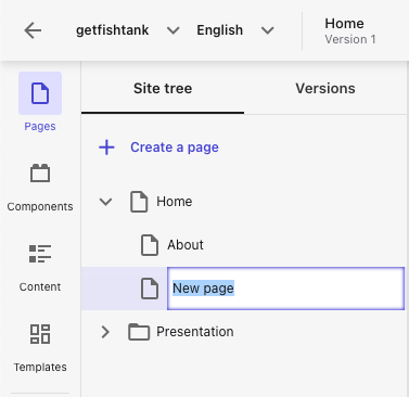
Name your new page in Sitecore XM Cloud Pages. Here you can see the same content tree structure in previous legacy versions of Sitecore.
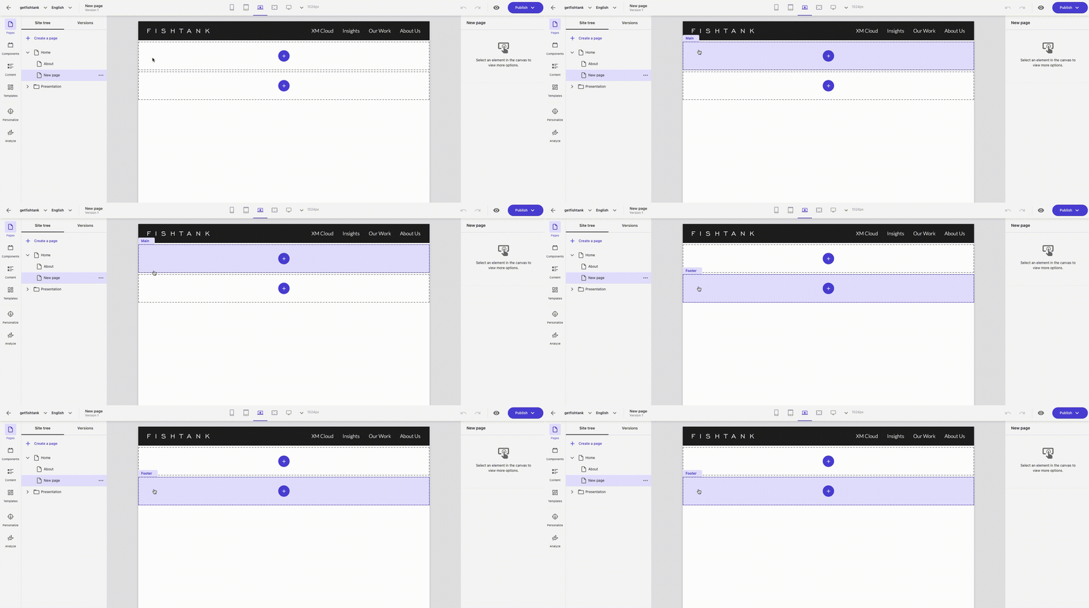
Your new page will have the basic layout that consists of the site title, main placeholder, footer placeholder.
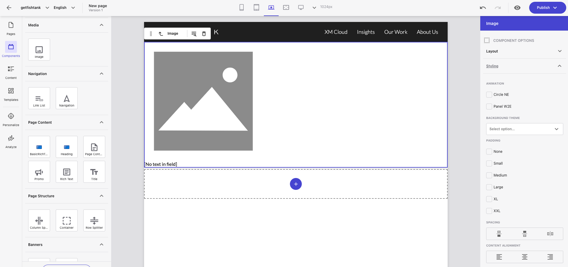
Navigate to the Components tab in the left-side menu and choose which component you want to add to the page. In this example we will use an Image component under the Media section.
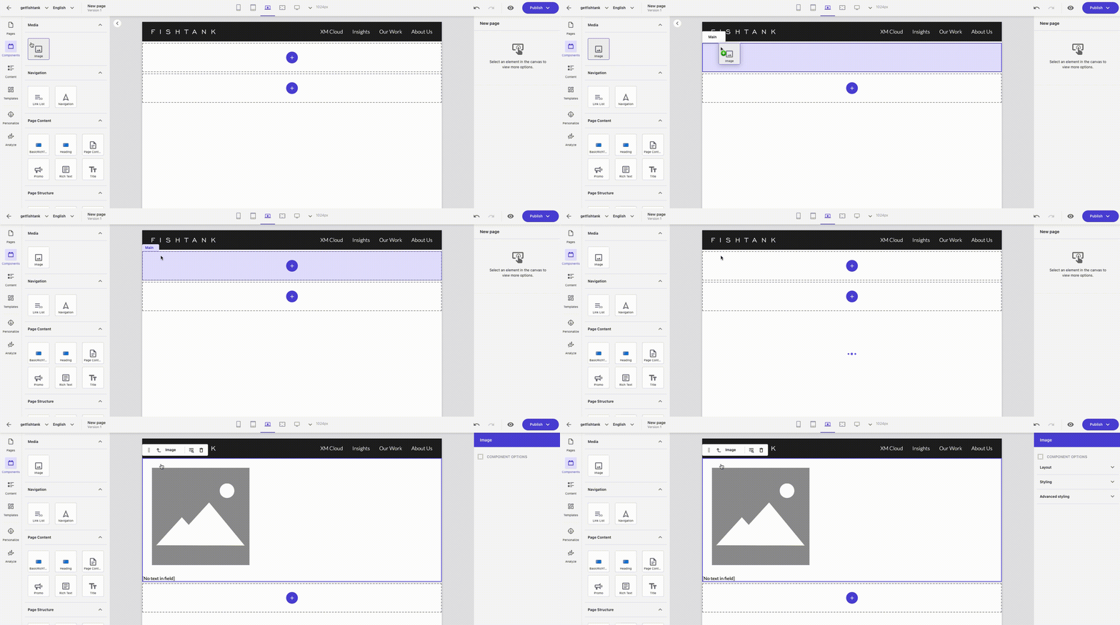
Click and drag the Image component to the placeholder where you want it to exist on the page. In this case, we added it to the main placeholder.
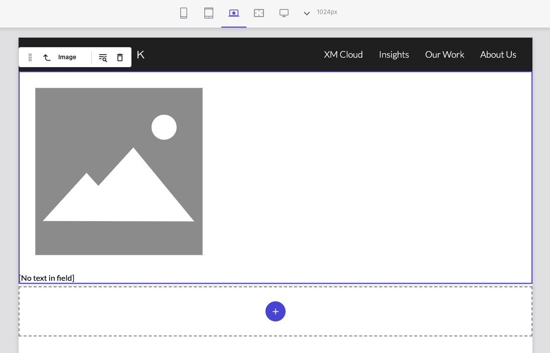
With the component selected, a small menu will appear above the component in the Pages editor. Here we have the option to move the component, select the parent element, select a content item, or delete it.
Select the component you want to edit, and a menu will appear on the right side of the Pages editor. Here you will find the different component options such as layout, styling, and advanced styling details.
By using the built-in components in Sitecore XM Cloud Pages, organizations can streamline their development process, and empower marketers to focus on delivering engaging experiences to their customers. The OOTB components in Sitecore XM Cloud Pages provide a foundation for building high-quality digital experiences. This low code / no code integrated authoring experience also enabling organizations to add custom functionality as needed.
If your organization is using Sitecore and is ready to make the move to XM Cloud, reach out to our friendly Fishtank team to get started. If you're already on XM Cloud and are wondering how to access your Sitecore XM Cloud instance, read our blog here.
Until then, happy marketing!